CTA Brand Theme
Use these classes and CSS variables to brand the ai12z Search control. The screenshots call out where each style applies.
Where to put styles
Add your overrides to a site stylesheet that loads after the ai12z control, or place them in a page-level style block. CSS variables are the primary way to theme the control and work across the shadow DOM.
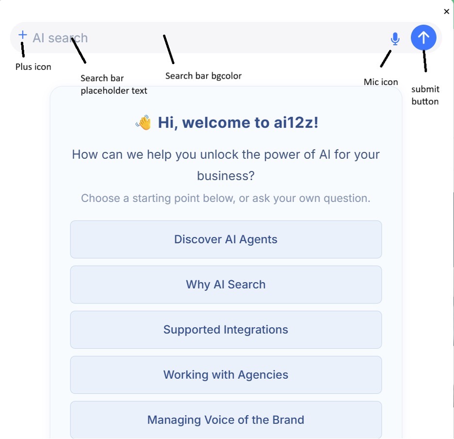
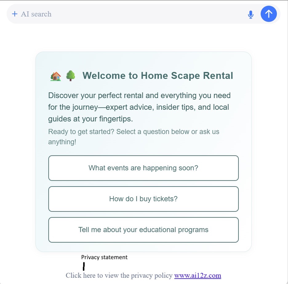
Search bar (input field)
Classes
- .custom-input — Input field styling (padding, radius, borders)
- .btn-bg-color — Submit button (arrow) background
- .mic-icon — Microphone icon
- .plus-icon — Plus icon
- .custom-input:focus — Focus/active border color
- .custom-input::placeholder — Placeholder typography and color
- .model-heading — Heading above the search bar
CSS variables
- --ai12z-searchbar-bgcolor — Search bar background color
- --ai12z-plus-icon-color — Plus icon color
- --ai12z-mic-color — Microphone icon color
- --ai12z-button-bgcolor — Submit button background color
- --ai12z-border-color — Input border color (usually matches the search bar background)
- --ai12z-input-placeholder-color — Placeholder text color
- --ai12z-input-placeholder-font-size — Placeholder font size
- --ai12z-heading-color — Heading color
- --ai12z-heading-font-size — Heading font size
Example
:root {
  --ai12z-searchbar-bgcolor: #f3f6fb;
  --ai12z-border-color: #e6eefc;
  --ai12z-plus-icon-color: #6b7a99;
  --ai12z-mic-color: #1f6fff;
  --ai12z-button-bgcolor: #1f6fff;
  --ai12z-input-placeholder-color: #9aa5b1;
  --ai12z-input-placeholder-font-size: 15px;
  --ai12z-heading-color: #1e293b;
  --ai12z-heading-font-size: 20px;
}

.custom-input::placeholder {
  color: var(--ai12z-input-placeholder-color);
}
.custom-input:focus {
  outline: none;
  border-color: var(--ai12z-border-color);
}
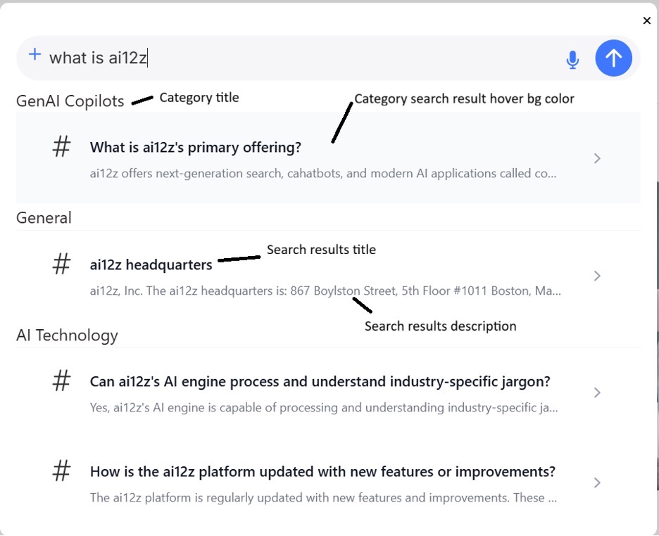
Search suggestions (categories and results)
Classes
- .custom-title — Category section title
- .cta-search-text — Result title
- .cta-search-results-list:hover — Hover state for a result row
- .cta-search-description — Result description text
CSS variables
- --ai12z-category-font-size — Category title font size
- --ai12z-category-font-color — Category title color
- --ai12z-search-result-title-color — Result title color
- --ai12z-search-result-title-font-size — Result title font size
- --ai12z-search-result-description-color — Result description color
- --ai12z-search-result-description-font-size — Result description font size
- --ai12z-hover-bg-color — Hover background for result rows
Example
:root {
  --ai12z-category-font-size: 14px;
  --ai12z-category-font-color: #475569;
  --ai12z-search-result-title-color: #0f172a;
  --ai12z-search-result-title-font-size: 16px;
  --ai12z-search-result-description-color: #64748b;
  --ai12z-search-result-description-font-size: 13px;
  --ai12z-hover-bg-color: #eef2ff;
}
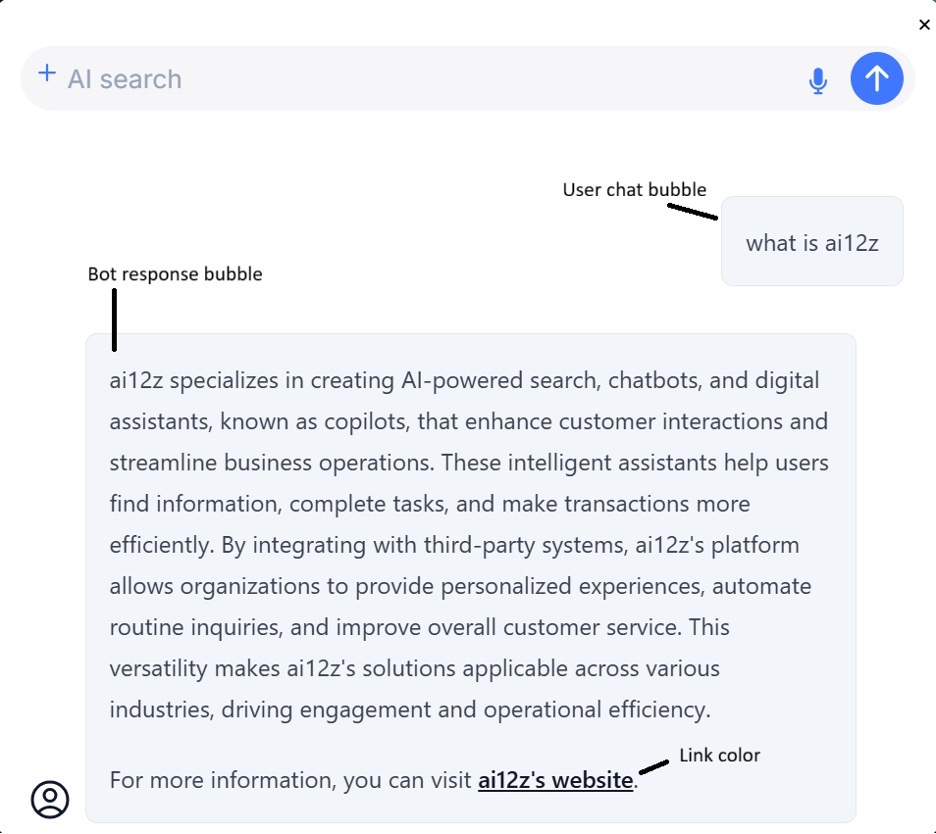
Chat bubbles (user and bot)
Classes
- .chat-list-item — Bubble container
- .non-pending-user — User bubble background
- .copy-btn — Copy/feedback icons (hover state)
- .ai12z-cta-link — Link color inside a bot response
- .ai12z-cta-link:hover — Link hover color inside a bot response
CSS variables
- --ai12z-bubble-font-color — Bubble font color
- --ai12z-bubble-background — Bubble background color
- --ai12z-feedback-color — Feedback icon hover color
- --ai12z-feedback-selected — Selected state color (e.g., thumbs up/down)
- --ai12z-button-bgcolor — Button background inside responses
- --ai12z-link-color — Inline link color in responses
- --ai12z-link-hover-color — Inline link hover color
Example
:root {
  --ai12z-bubble-font-color: #0f172a;
  --ai12z-bubble-background: #e6f0ff;
  --ai12z-feedback-color: #64748b;
  --ai12z-feedback-selected: #1f6fff;
  --ai12z-link-color: #1f6fff;
  --ai12z-link-hover-color: #1747b3;
}

.chat-list-item {
  color: var(--ai12z-bubble-font-color);
}
.ai12z-cta-link {
  color: var(--ai12z-link-color);
}
.ai12z-cta-link:hover {
  color: var(--ai12z-link-hover-color);
}
Privacy statement
Class
- .custom-msg — Privacy statement typography
CSS variable
- --ai12z-font-mute — Privacy statement font color
Example
:root {
  --ai12z-font-mute: #6b7280;
}
.custom-msg {
  color: var(--ai12z-font-mute);
}
--ai12z-dialog-margin - This will allow us to customize the cta modal dialog. --ai12z-search-page-bgcolor - This will allow us to customize the search bar background color for the search results page. --ai12z-search-page-button-bgcolor - This will allow us to customize the button background color in search results page.
:root {
  --ai12z-dialog-margin: 3rem 0 0 0;
  --ai12z-search-page-bgcolor: #f3f4f6;
  --ai12z-search-page-button-bgcolor: var(--ai12z-primary-color);
}
Notes
- If a style doesn’t apply, confirm your stylesheet loads after the control and that you’re overriding CSS variables at :root or a parent container.
- Classes target elements exposed by the control; prefer variables for theme-wide changes.
- Keep adequate contrast for accessibility when changing text and background colors.
Troubleshooting
- Variable not applying? Confirm your stylesheet loads after the control script and the variable is defined at
:root. - Cached old styles? Hard refresh or clear cache (Ctrl/Cmd + Shift + R).
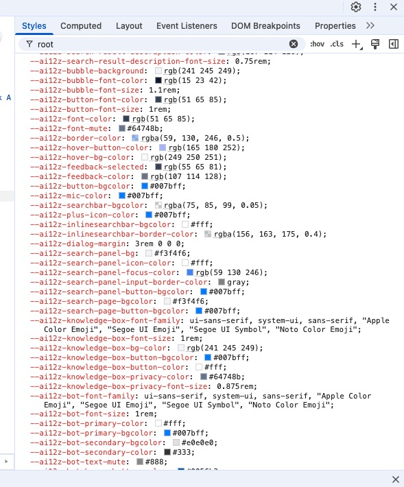
- Unsure which variable to change? Inspect the element in DevTools, search for
--ai12zin the Styles panel to see applied sources.