MCP (Model Context Protocol) Setup
1. Select MCP as the Data Source
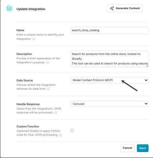
In the Properties dialog, set the Data Source to Model Context Protocol (MCP).
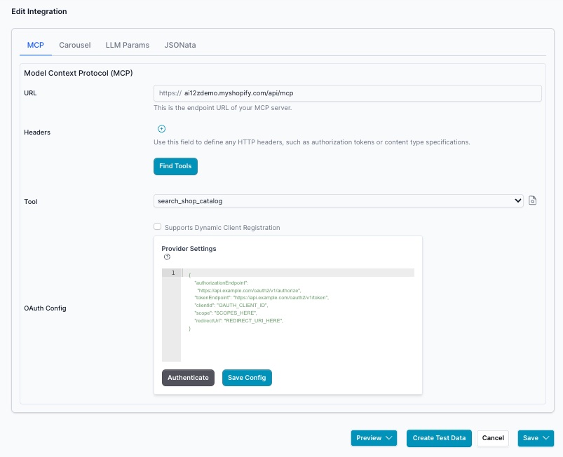
2. Configure MCP Server URL and Headers
In the Edit dialog, under the Model Context Protocol (MCP) section:
- Enter the MCP server endpoint URL.
- (Optional) Add any required HTTP headers, such as an API key or security token.
- (Optional) OAuth provider configuration — see OAuth Configuration below.
Tab API - MCP
Tab Carousel
By default the Carousel should be "Custum". Vibe coding only works with custom
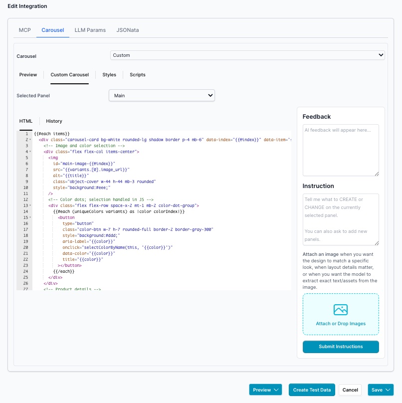
The Panels are selected by the Selected Panel, often only one
Vibe coding experience with update the Custom Carousel handlebars code, Styles and Scripts. Do vibe coding after you have collected test data.
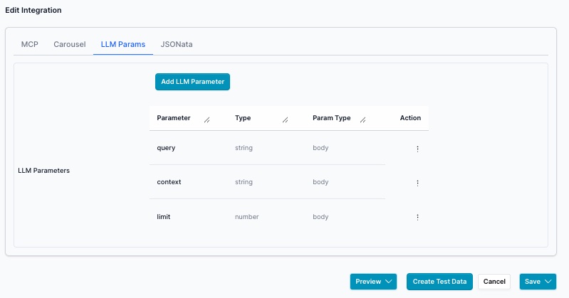
Tab LLM Params
JSONata
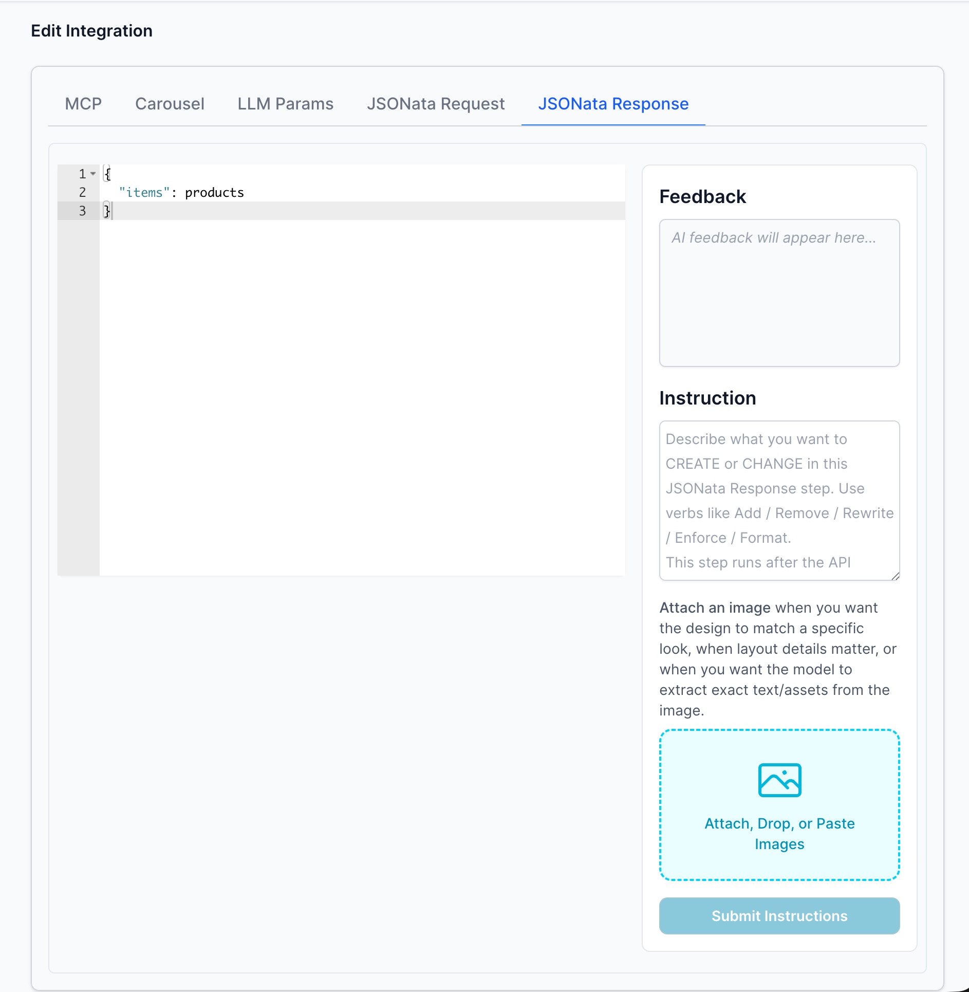
Note you need to return items array. If you endpoint does not return an array of items in this case an array of products you use JSONata to transform to items. It will not work if the array is not items and you plan to display a list.
OAuth Configuration
If your MCP server requires OAuth authentication, you must provide an OAuth Config JSON block in the MCP settings.
Required: Redirect URL
The redirectUri must be set to the portal page URL of this integration — the browser address bar URL while editing this agent, with no query parameters.
Format:
https://app.ai12z.net/portal/projects/[YOUR_PROJECT_ID]/agents/[YOUR_AGENT_ID]
Important: Save the integration first so the agent gets an ID, then copy the URL from your browser address bar and use that as the
redirectUri.
The platform uses this URL in two places:
- As the
redirect_uriin the OAuth authorization request (where the provider sends the user back after login) - In the token exchange request — it must match exactly what was used in step 1
Both steps use the same value, so the user must be on that exact page when they click Authenticate.
Register the Redirect URL with Your OAuth Provider
You must add this same URL as an authorized redirect URI in your OAuth provider's settings (e.g., Google Cloud Console, Okta, Azure AD). The authorization will fail if it is not registered.
Example OAuth Config JSON
{
  "clientId": "your-client-id",
  "clientSecret": "your-client-secret",
  "authorizationUrl": "https://provider.example.com/oauth/authorize",
  "tokenUrl": "https://provider.example.com/oauth/token",
  "redirectUri": "https://app.ai12z.net/portal/projects/abc123/agents/xyz789",
  "scopes": ["read", "write"]
}
3. Discover Tools
Click Find Tools to fetch the available tools from your MCP server.
- Select a tool from the dropdown.
- Click the magnifying glass icon to inspect the tool’s schema.

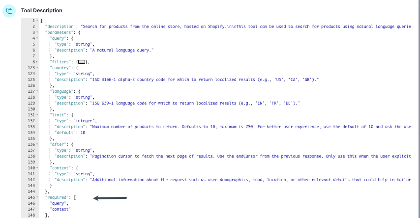
4. Review Tool Schema
Check the tool schema for required parameters. At minimum, you must provide all parameters marked as required.
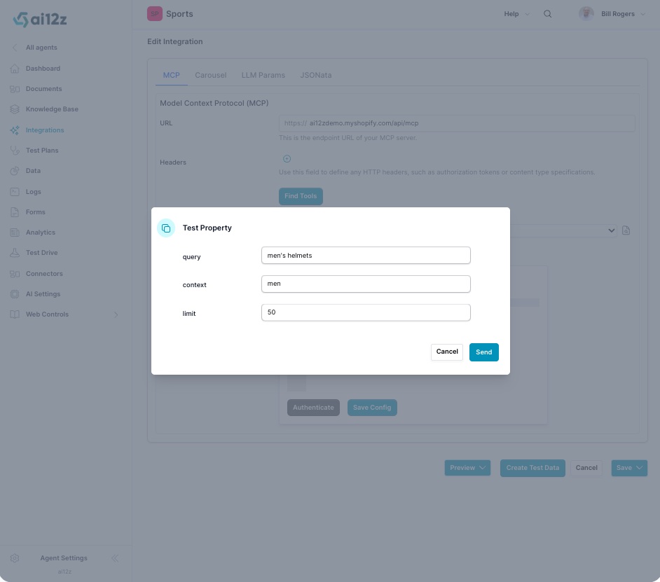
5. Create Test Data
- Click the Create Test Data button.
- Fill in the property values (e.g.,
query,context,limit). - Click Send.
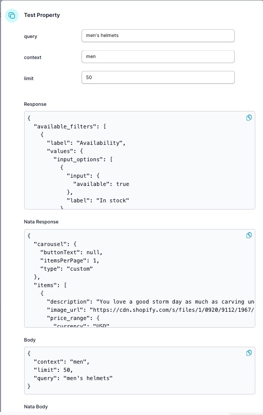
Review the Response section. If the array key is not items, you’ll need to map it in the next step.
Test button
View the results from the endpoint
Using Vibe coding
Vibe coding needs test data, so run this once, and its results are stored in the database. Note you need to use JSONata to transform to items as an array
You can upload a mock up of what you want to use for look and feel