Carousel - Overview
Overview and Purpose
The Carousel Control in ai12z provides a dynamic, interactive way to present large datasets without relying solely on LLM-generated output for rendering. While RAG (Retrieval-Augmented Generation) is excellent for precise, document-based queries, scenarios like browsing restaurant menus, exploring product catalogs, or selecting movie options often involve extensive datasets that are inefficient to render directly through LLM output.
It’s not that the LLM can’t handle large JSON payloads. Modern models with 128K context windows can process substantial input. The real challenge is output token generation: large responses increase latency and cost, making direct rendering of many items inefficient.
A client-side carousel bypasses this bottleneck at the display layer by handing large datasets directly to the Bot UI. This dramatically improves responsiveness and cost efficiency, while still allowing optional LLM support for summary, comparison, and contextualization.
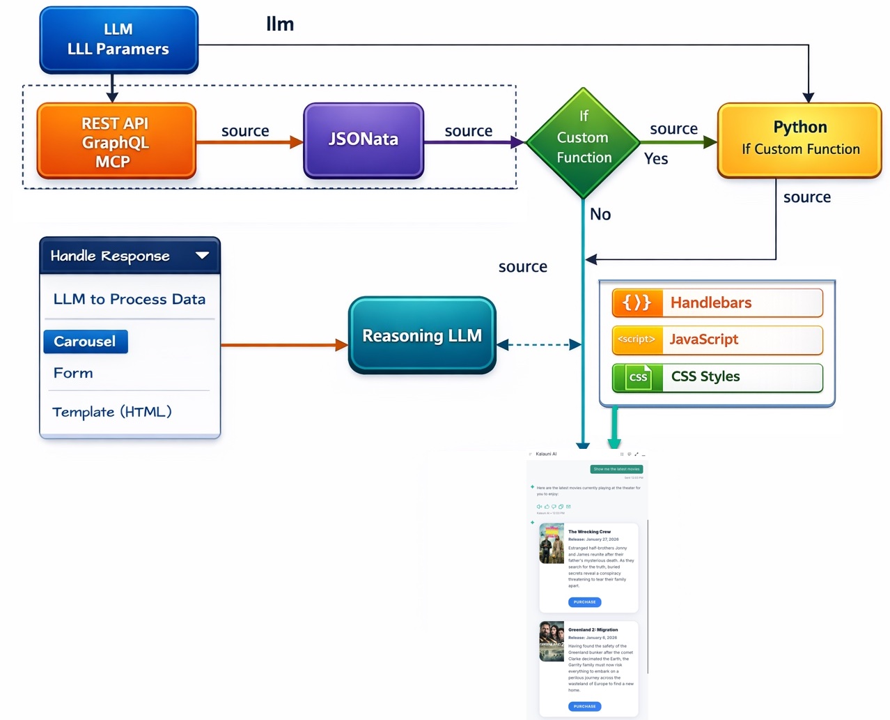
Block Diagram
Below are eight reasons why you might incorporate a Carousel into your ai12z Agent interface. These examples highlight both user experience enhancements and strategic business objectives, including e-commerce scenarios with data sourced from APIs (MCP, REST or GraphQL) such as Shopify’s GraphQL endpoints.
-
Visually Rich Product Browsing:
Instead of returning a long text list of products, a carousel can present items with images, titles, and short descriptions in a visually appealing, swipeable interface. For instance, when querying a Shopify GraphQL endpoint for “women’s summer dresses,” the Agent can return a carousel of dresses along with their images, prices, and brief details, letting users quickly scan and select the one they like. -
Curated Recommendations & Upsells:
A carousel makes it easy to highlight products related to a user’s query—such as accessories to match a previously viewed item. With data fetched from a REST API, the Agent can show a rotating carousel of recommended items, allowing the user to visually compare options and discover complementary purchases without sifting through multiple pages. -
Location-Based Listings (e.g., Restaurants, Hotels):
For a user asking for “restaurants near my hotel,” the Agent can fetch geo-specific data from a RESTful location service and return a carousel of restaurant images, short descriptions, cuisines, and links to menus. The user can swipe through the results and pick one that looks appealing, enhancing overall convenience and decision-making. -
Interactive Product Customization:
By embedding forms or selection fields inside the carousel panels, users can customize their product options (e.g., selecting size, color, or adding gift wrapping) before finalizing their purchase. With Shopify GraphQL, for example, you could fetch product variants in real-time and present them in a carousel format, letting the user pick from multiple styles in a visually engaging manner. -
Category & Collection Showcases:
If a user requests “Show me the new arrivals,” the Agent can query a GraphQL API for a store’s latest collection and return a carousel of featured products. Each carousel card might include product images, pricing tiers, and quick-add-to-cart buttons, helping users rapidly explore fresh inventory and boosting engagement with new releases. -
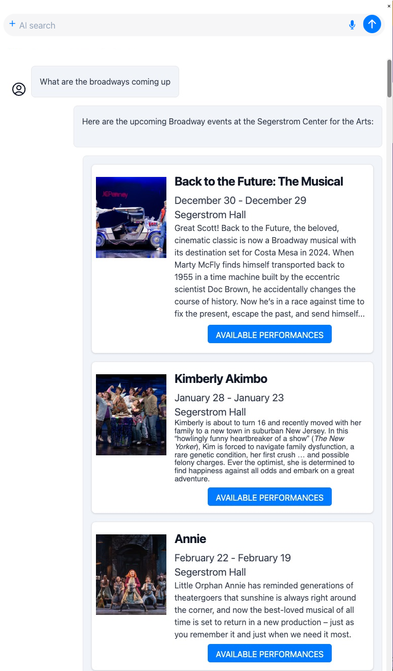
Event Listings & Ticket Booking:
Suppose the user asks for upcoming concerts or shows. The Agent can pull event data from a REST endpoint and display them in a carousel, each with an “available performances” button that opens a panel showing specific dates and seat selection forms. This visual, step-by-step approach simplifies complex workflows (like ticket bookings) and creates a more guided, user-friendly experience. -
Personalized Recommendations Using User Parameters:
The carousel can leverage user parameters or preferences (e.g., dietary restrictions, preferred price range, or style preferences) to filter results before display. For example, if the user mentions they’re vegan, a Shopify GraphQL query can return only vegan-friendly products, arranged in a carousel for easy scanning. Personalized, visually driven recommendations encourage faster conversions and reduce decision fatigue. -
Rapid Comparison of Multiple Options:
When a user says, “Show me options for [X],” returning a carousel enables them to quickly compare multiple items side-by-side without needing to read through long descriptions. For instance, if they’re researching different laptop models pulled from a REST endpoint, a carousel can present each model’s key specs, price, and warranty at a glance. Users can then swipe through and pick the one that fits best, providing an efficient and enjoyable shopping or decision-making experience.
In essence, the Carousel Control in ai12z transforms raw data into a visually navigable, interactive interface, streamlining product discovery, enhancing user interaction, and ultimately improving the user’s overall journey—whether they’re browsing inventory, booking services, or exploring personalized recommendations.
Custom Carousel
The Custom Carousel accepts structured data to display a series of interactive items, each with multiple panels, forms, images, and detailed content. Each item can include titles, images, descriptions, forms, and buttons with various functions.
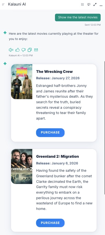
Example: Two-Panel Movie Carousel
This example demonstrates a carousel with two panels: a list panel showing latest movies, and a purchase panel where users can buy tickets.
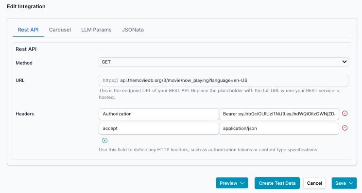
Step 1: Configure REST API
Set up the REST API endpoint to retrieve movie data:
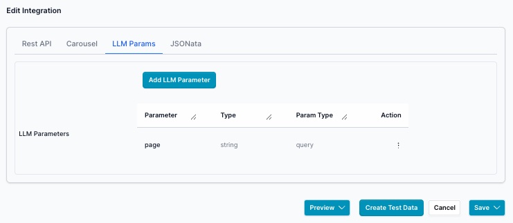
Step 2: Define LLM Parameters
Since the movie API returns many results, add a page parameter to control pagination:
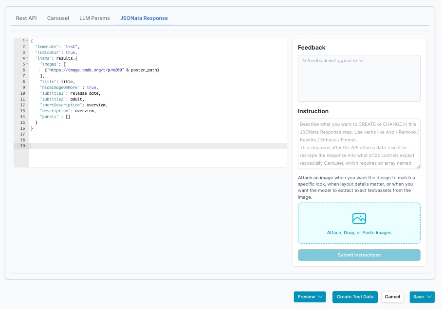
Step 3: Configure JSONata Transformation
Transform the API response to the format needed for the carousel:
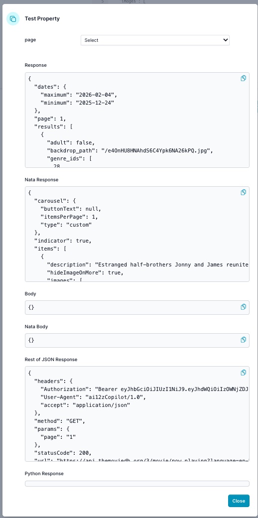
Step 4: Generate Test Data
Click the Create Test Data button to test your API configuration:

Review the returned data. Note that the Nata Response contains an items array, which is the required array structure for the carousel:
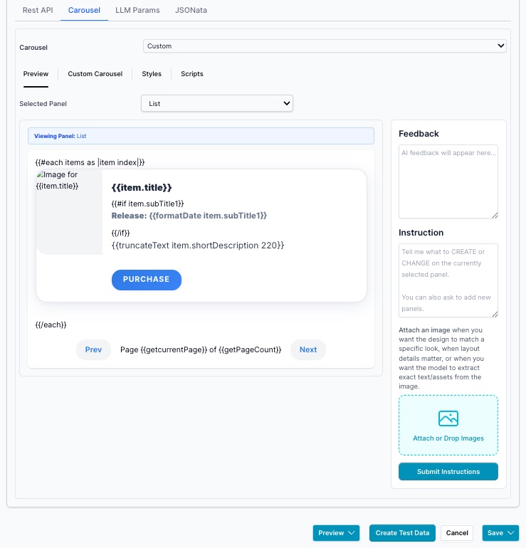
Step 5: Design Carousel Panels
List Panel - Use Vibe Coding to create the movie list display:
Purchase Panel - Design the second panel for ticket purchase:
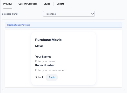
Carousel Instructions
Use the following instructions for Vibe Coding to generate the carousel:
Create a list of panels for the latest movies, and create a second panel
that allows you to purchase the movie on the 2nd panel. Ask for the person's
name and room number with a Submit and Back button. When they submit, use a
JavaScript alert to show the result.
Preview in Bot
The completed carousel displays in the bot interface: