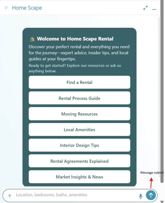
Bot UI – Robust Section-by-Section Definition
1. Toolbar Section (Header)
Overview
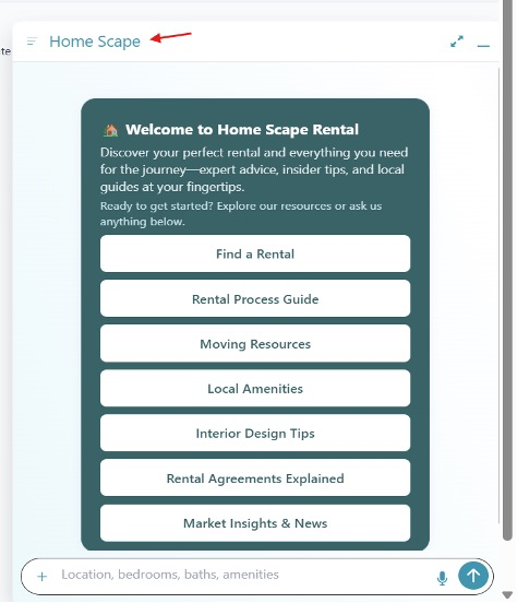
The Toolbar is the persistent header at the top of the AI12Z Bot. It provides users with context (via the Bot Title) and immediate access to window management (expand/minimize) and configuration or navigation (menu).
Key Components & Functions
-
Bot Title
-
Text: Displays the bot or organization’s name (e.g., “Home Scape”).
-
Purpose: Clearly communicates the current context to the user.
-
Class Name:
.heading -
Global Variable:
--ai12zBot-v2-title-color: #2095ae -
Customization:
.heading {
  color: var(--ai12zBot-v2-title-color, #2095ae);
  font-size: 1.1rem;
  font-weight: 500;
}
:root {
  --ai12zBot-v2-title-color: #2095ae;
}
-
-
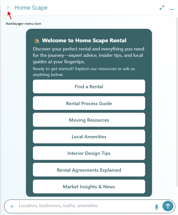
Hamburger Menu Icon
-
Location: Left-aligned, beside the title.
-
Purpose: Opens a navigation or settings drawer.
-
Class Name:
.modal-toolbar-icon -
Global Variable:
--ai12zBot-v2-toolbar-icon-color: #2095ae -
**Hide Hamberger Menu
.toolbar-overflow-actions button {
  display: none;
}
-
Expand/Minimize Icons
- Location: Right side of the Toolbar.
- Purpose: Expands to widescreen or minimizes the chat widget.
- Class Name:
.modal-toolbar-icon - Global Variable:
--ai12zBot-v2-toolbar-icon-color: #2095ae
-
Hide Expanded button Icon
.wes-text-body2 {
  display: none;
}
-
Feedback Icon
-
Global Variables:
-
Location: Under the answer bubble.
-
Purpose: It is a thumbs up icon and thumbs down icon to give feedback like or did not like the response. --ai12zBot-v2-feedback-color: var(--ai12zBot-v2-primary-color); --ai12zBot-v2-feedback-selected: var(--ai12zBot-v2-primary-color);
-
Copy Icon
-
Global Variables:
-
Location: Shows up need to the feedback icons
-
Purpose: When clicked this icon bring ups the Mail answer dialog --ai12zBot-v2-copy-btn-color: var(--ai12zBot-v2-primary-color);
-
Hamburger Menu Items
-
Purpose: Actionable dropdown options (settings, help, etc.).
-
Class Name:
.dropdown-item-button -
Global Variables:
--ai12zBot-v2-dropdown-bgcolor: #2095ae--ai12zBot-v2-dropdown-font-color: #fff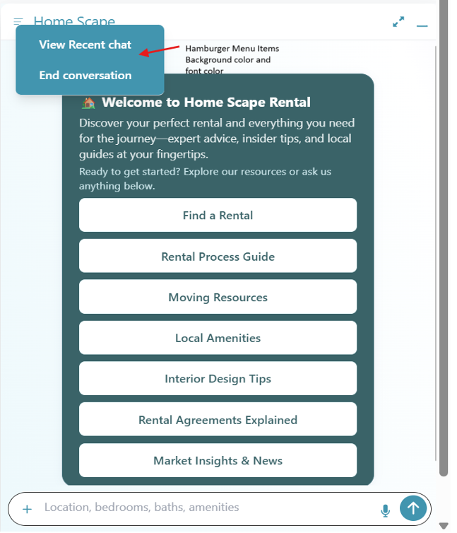
-
Typical Layout
+----------------------------------------------------+
| [☰]  Home Scape                             ⬜  🗕 |
+----------------------------------------------------+
- [☰] = Hamburger menu icon
- Home Scape = Bot title
- ⬜ = Expand
- 🗕 = Minimize
Accessibility & Best Practices
- All toolbar icons must be keyboard accessible (tab, enter/space).
- Use
aria-labelor tooltips for each icon. - Ensure color/contrast ratios meet accessibility standards.
2. SearchBar Section (Input Field & Controls)
Overview
The SearchBar is the main input area where users type questions, upload images, or activate voice commands.
Key Components & Functions
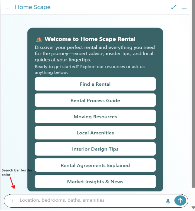
-
SearchBar Border
-
Purpose: Visually delineates the input area.
-
Class Name:
.textarea -
Global Variable:
--ai12zBot-v2-searchbar-border-color: #2095ae -
Example:
.textarea {
  border: 1px solid var(--ai12zBot-v2-searchbar-border-color, #2095ae);
}
-
-
Audio Icon (Mic)
- Purpose: Activates voice input.
- Class Name:
.mic-botIcon - Global Variable:
--ai12zBot-v2-searchbar-mic-color: #2095ae
-
Message Submit Background
- Purpose: Sets the background of the submit (send) button.
- Class Name:
#message-submit - Global Variable:
--ai12zBot-v2-searchbar-submit-bgcolor: #2095ae
-
Message Submit Icon
- Purpose: Icon inside the send button (typically a paper plane or arrow).
- Class Name:
.ai-icon - Global Variable:
--ai12zBot-v2-searchbar-submit-color: #fff
-
Image Upload Plus Icon
- Purpose: Lets users attach or upload images.
- Class Name:
.plus-icon - Global Variable:
--ai12zBot-v2-searchbar-plus-icon-color: #2095ae
Customization Methods
- Use class names for component-level styling.
- Use global CSS variables for theme-wide consistency.
Accessibility
- Input area and buttons must be focusable via keyboard.
- Provide clear labels for voice and image upload features.
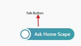
3. Floating Action Button (FAB) Section
Overview
The FAB is a floating action button that provides a quick way for users to launch or focus the bot.
Key Components
-
Bot FAB Button
- Purpose: The main floating action button.
- Class Name:
.fab > button - Global Variable:
--ai12zBot-v2-fab-button-background: #2095ae
-
Bot FAB Name
- Purpose: Shows the bot’s name alongside the FAB for brand clarity.
- Class Name:
.bot-name - Global Variables:
--ai12zBot-v2-bot-name-color: #fff--ai12zBot-v2-bot-name-font-weight: 500
Accessibility
- FAB must be reachable and actionable by keyboard.
- Use
aria-labelfor screen readers.
4. Expanded View (SearchBar & User Input Fieldset)
Overview
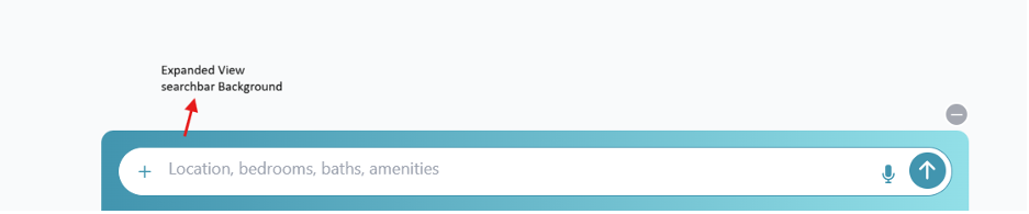
When the bot is expanded, the input area’s background color and style may be updated for a more immersive experience.
- Class Name:
.user-input-fieldset - Primary Color Variable:
--ai12zBot-v2-primary-color: #2095ae - Background Gradient:
--ai12zBot-v2-searchbar-background: linear-gradient(to right, var(--ai12zBot-v2-primary-color), oklch(0.85 0.09 202.36));
Best Practices
- Use gradients or brand colors to distinguish expanded states.
- Maintain high contrast for text input.
5. Message Bubble Section (Chat Thread)
Overview
Displays all user and bot messages with visually distinct bubbles.
Key Components
-
User Message Bubble
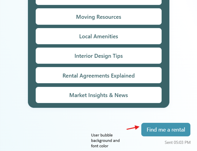
- Purpose: Shows messages from the user.
- Class Name:
.user-msg - Global Variables:
--ai12zBot-v2-user-bubble-background: #2095ae--ai12zBot-v2-user-bubble-font-color: #fff
-
Timestamp Under User Bubble
- Purpose: Displays when each message was sent.
- Class Name:
.text-body4 - Global Variables:
--ai12zBot-v2-timestamp-font-size: 12px--ai12zBot-v2-timestamp-font-color: #888
-
Default Bot Avatar
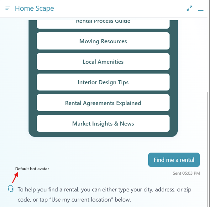
-
Purpose: Shows the default bot avatar when no custom image is set.
-
Class Name:
.default-botAvatar -
Global Variable:
--ai12zBot-v2-default-avatar-color: #2095ae -
Background Image of Message Area
-
Purpose: Sets the background of the chat area for added branding.
-
Class Name:
.modal -
Global Variable:
--ai12zBot-v2-modal-backgroundImage: linear-gradient(
  248.35deg,
  rgb(32, 149, 174) -11.3%,
  rgb(244, 244, 254) 16.44%,
  rgb(255, 255, 255) 28.3%,
  rgb(230, 247, 251) 89.69%,
  rgb(192, 225, 235) 101.94%
);
-
6. Custom Button and Link Section
Overview�
Buttons and links within messages or cards allow for interaction and navigation.
Key Components
- Custom Template Button
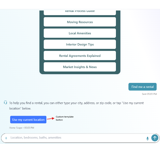
-
Purpose: Action button in custom templates, quick actions.
-
Class Name:
.ai12zBtn -
Global Variables:
--ai12zBot-v2-button-background: #2095ae--ai12zBot-v2-button-font-color: #fff -
Custom Template Link
- Purpose: Hyperlink for navigating out or showing more info.
- Class Name:
.ai12z-link - Global Variables:
--ai12zBot-v2-link-color: #2095ae--ai12zBot-v2-link-hover-color: #2095ae
-
Back Button Icon
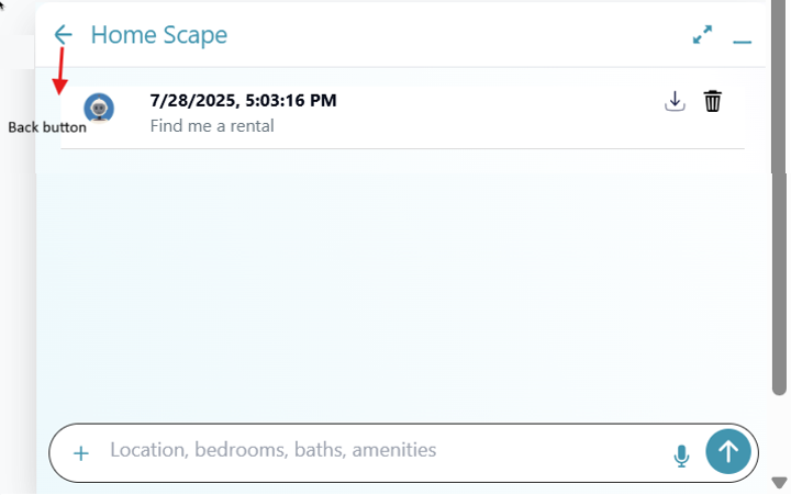
- Purpose: Navigates back from viewing recent conversations to the bot normal view.
- Class Name:
.back-btn svg - Global Variable:
--ai12zBot-v2-back-button-color: #2095ae
7. Privacy Statement Section
Overview
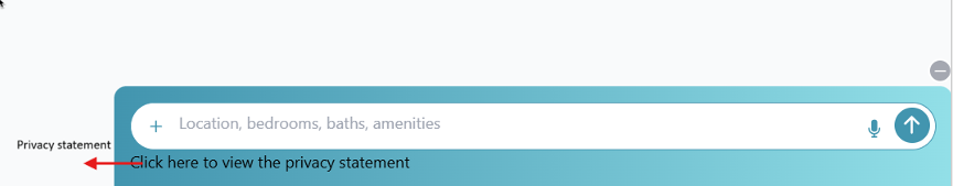
Displays the privacy statement or compliance notification.
- Class Name:
.privacy-msg - Global Variables:
--ai12zBot-v2-privacy-text-color: #000--ai12zBot-v2-privacy-text-font-size: 16px
Best Practices
- Link to full privacy policy if possible.
- Keep statement clear, concise, and accessible.
Global Customization & Accessibility
-
All styling can be controlled via class selectors or CSS custom properties (variables) for easy rebranding and white-labeling.
-
Accessibility:
- All actionable elements should support keyboard navigation.
- Provide ARIA labels or roles for all icons/buttons.
- Maintain proper color contrast for compliance.
Appendix: Example Global CSS
:root {
  --ai12zBot-v2-primary-color: #2095ae;
  --ai12zBot-v2-secondary-color: #fff;

  --ai12zBot-v2-title-color: var(--ai12zBot-v2-primary-color);
  --ai12zBot-v2-bot-name-color: var(--ai12zBot-v2-secondary-color);
  --ai12zBot-v2-bot-name-font-weight: 500;

  --ai12zBot-v2-feedback-color: var(--ai12zBot-v2-primary-color);
  --ai12zBot-v2-feedback-selected: var(--ai12zBot-v2-primary-color);
  --ai12zBot-v2-copy-btn-color: var(--ai12zBot-v2-primary-color);

  --ai12zBot-v2-toolbar-icon-color: var(--ai12zBot-v2-primary-color);

  --ai12zBot-v2-dropdown-bgcolor: var(--ai12zBot-v2-primary-color);
  --ai12zBot-v2-dropdown-font-color: var(--ai12zBot-v2-secondary-color);

  --ai12zBot-v2-searchbar-border-color: var(--ai12zBot-v2-primary-color);
  --ai12zBot-v2-searchbar-submit-bgcolor: var(--ai12zBot-v2-primary-color);
  --ai12zBot-v2-searchbar-submit-color: var(--ai12zBot-v2-secondary-color);
  --ai12zBot-v2-searchbar-mic-color: var(--ai12zBot-v2-primary-color);
  --ai12zBot-v2-searchbar-plus-icon-color: var(--ai12zBot-v2-primary-color);
  --ai12zBot-v2-searchbar-background: linear-gradient(
    to right,
    var(--ai12zBot-v2-primary-color),
    oklch(0.85 0.09 202.36)
  );

  --ai12zBot-v2-fab-button-background: linear-gradient(
    to right,
    var(--ai12zBot-v2-primary-color),
    oklch(0.64 0.11 202.5)
  );

  --ai12zBot-v2-user-bubble-background: var(--ai12zBot-v2-primary-color);
  --ai12zBot-v2-user-bubble-font-color: var(--ai12zBot-v2-secondary-color);

  --ai12zBot-v2-timestamp-font-size: 12px;
  --ai12zBot-v2-timestamp-font-color: #888;

  --ai12zBot-v2-default-avatar-color: var(--ai12zBot-v2-primary-color);

  --ai12zBot-v2-modal-backgroundImage: linear-gradient(
    248.35deg,
    rgb(32, 149, 174) -11.3%,
    rgb(244, 244, 254) 16.44%,
    rgb(255, 255, 255) 28.3%,
    rgb(230, 247, 251) 89.69%,
    rgb(192, 225, 235) 101.94%
  );

  --ai12zBot-v2-button-background: var(--ai12zBot-v2-primary-color);
  --ai12zBot-v2-button-font-color: var(--ai12zBot-v2-secondary-color);

  --ai12zBot-v2-link-color: var(--ai12zBot-v2-primary-color);
  --ai12zBot-v2-link-hover-color: var(--ai12zBot-v2-primary-color);

  --ai12zBot-v2-back-button-color: var(--ai12zBot-v2-primary-color);

  --ai12zBot-v2-privacy-text-color: #000;
  --ai12zBot-v2-privacy-text-font-size: 16px;
  --ai12zBot-v2-privacy-link-color: var(--ai12zBot-v2-secondary-color);
  --ai12zBot-v2-privacy-link-font-size: 16px;
}
Troubleshooting
- Variable not applying? Confirm your stylesheet loads after the control script and the variable is defined at
:root. - Cached old styles? Hard refresh or clear cache (Ctrl/Cmd + Shift + R).
- Unsure which variable to change? Inspect the element in DevTools, search for
--ai12zBotin the Styles panel to see applied sources.