Search/Ask AI Web Component
Overview
The ai12z Search/Ask web component allows seamless integration of AI-powered search capabilities into your HTML pages in two ways. This component is loaded from a Content Delivery Network (CDN) and can be customized through a variety of properties. See Project Settings API Key to get your API key

How to Use
-
To integrate AI-powered search capabilities, follow either of the two methods below:
-
Insert the following script and stylesheet in the head section of your HTML:
<script
  type="module"
  src="https://cdn.ai12z.net/pkg/ai12z@latest/dist/esm/library.js"
></script>
<link
  rel="stylesheet"
  href="https://cdn.ai12z.net/pkg/ai12z@latest/dist/library/library.css"
/> -
Add the following script to the HTML section of the Tag Configuration in Google Tag Manager.
<script>
  ;(function () {
    var script = document.createElement("script")
    script.type = "module"
    script.src =
      "https://cdn.ai12z.net/pkg/ai12z@latest/dist/esm/library.js"
    script.async = true
    document.head.appendChild(script)

    var link = document.createElement("link")
    link.rel = "stylesheet"
    link.href =
      "https://cdn.ai12z.net/pkg/ai12z@latest/dist/library/library.css"
    document.head.appendChild(link)

    script.onload = function () {
      if (window.Bot) {
        window.Bot.init()
      }
    }
  })()
</script>
-
-
Implement the Component
You can use the<ai12z-cta>tag to include the search component in your HTML. This tag supports customization through several attributes and slots.
Example Code
<html>
  <head>
    <script
      type="module"
      src="https://cdn.ai12z.net/pkg/ai12z@latest/dist/esm/library.js"
    ></script>
    <link
      rel="stylesheet"
      href="https://cdn.ai12z.net/pkg/ai12z@latest/dist/library/library.css"
    />
  </head>
  <body>
    <div>
      <ai12z-cta data-key="your_api_key_here"></ai12z-cta>
    </div>
    <!-- Style customization example, place after the `ai12z-cta tag to overide the style -->
    <style>
      ai12z-cta {
        --ai12z-font-family: "Inter", sans-serif;
        --ai12z-font-size: 16px;

        --ai12z-primary-color: rgb(165 180 252);
        --ai12z-secondary-color: #64748b;

        --ai12z-heading-color: rgb(51 65 85);
        --ai12z-heading-font-size: 1.2rem;

        --ai12z-input-placeholder-color: rgb(148 163 184);
        --ai12z-input-placeholder-font-size: 1.1rem;

        --ai12z-followup-color: rgb(107 114 128);
        --ai12z-followup-font-size: 1rem;
        --ai12z-followup-bg-color: rgb(30 64 175);

        --ai12z-category-font-color: #2a2727;
        --ai12z-category-font-size: medium;

        --ai12z-search-result-title-color: #111827;
        --ai12z-search-result-title-font-size: 0.875rem;

        --ai12z-search-result-description-color: rgb(107 114 128);
        --ai12z-search-result-description-font-size: 0.75rem;

        --ai12z-bubble-background: rgb(241 245 249);
        --ai12z-bubble-font-color: rgb(15 23 42);
        --ai12z-bubble-font-size: 1.1rem;

        --ai12z-button-font-color: rgb(51 65 85);
        --ai12z-button-font-size: 1rem;

        --ai12z-font-color: rgb(51 65 85);
        --ai12z-font-mute: #64748b;
        --ai12z-border-color: rgba(59, 130, 246, 0.5);
        --ai12z-hover-button-color: rgb(165 180 252);
        --ai12z-hover-bg-color: rgb(249 250 251);

        --ai12z-feedback-selected: rgb(55 65 81);
        --ai12z-feedback-color: rgb(107 114 128);

        --ai12z-dialog-margin: 3rem 0 0 0;
      }
    </style>
  </body>
</html>
Customization Options
Previously we have used this below mentioned properties to configure our search component. Now we have an option to configure those properties via search page.
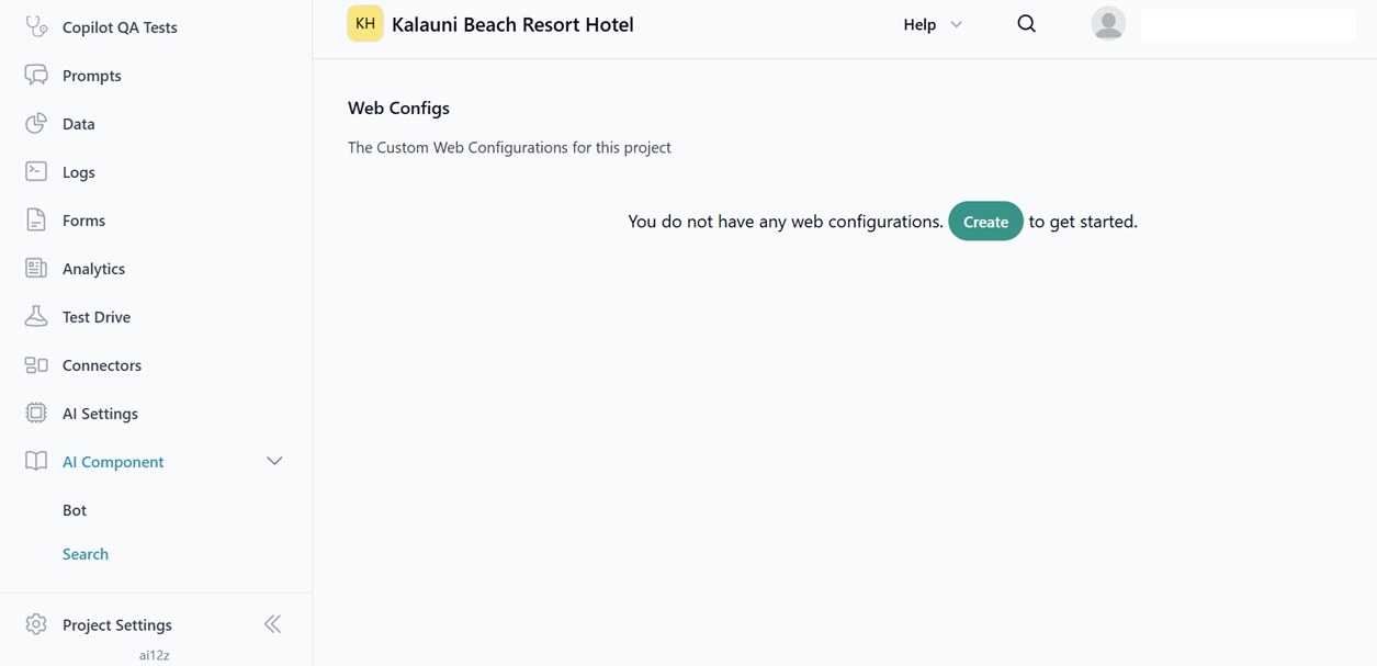
Step 1:
Go to the project, select the Controls menu from the left navigation panel, and click on the Search menu to create a new search configuration.
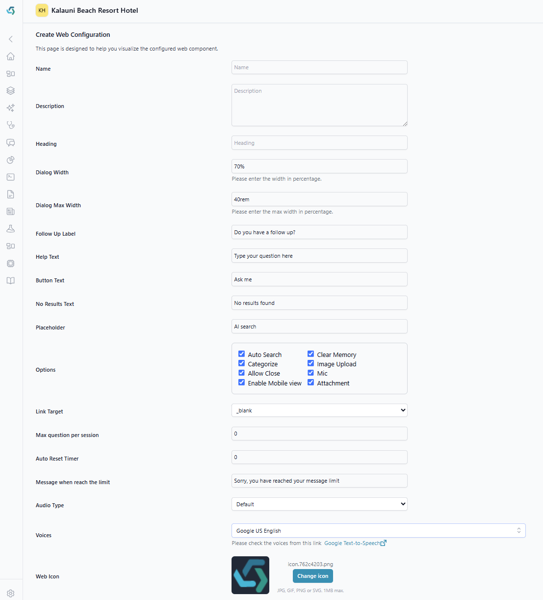
Step 2:
Customize your search here with a set of predefined settings.
-
Heading - Text displayed above the control.
-
Button Text - Custom text for the button.
-
Help Text - Helper text will displayed in end of the search dialog.
-
No results found - allows us to customize the no results found text
-
Auto search - If true, returns search results as you type.
-
Placeholder - allows us to customize the placeholder text.
-
Categorize - If true, output will be organized by category if categories are set up.
-
Follow up label - Label for follow-up questions
-
clear memory - If true, clears the search history upon closing the dialog
-
Image upload - Enable upload icon
-
Enable mobile view - If true, on mobile view, it occupies entire width of the screen
-
Link Target - Select the option to load the external links. The options are _blank, _self, _parent.
-
max Question Per Session - A session allows only a fixed number of questions. By default, it set to zero.
-
auto Reset Timer - The timer will reset itself automatically after a set period. By default, it set to zero.
-
message WhenvReach ThevLimit - A message will be displayed when the limit is reached.
-
buttons - The button array helps us to configure the Hamburger menu on the bot. The label under the button array will show it in the menu list.
-
audio Type - This will allow us to choose the audio type for our response based on the selection of type with default and google.
-
voices - This will allow us to pick the voices based on the selection of audio type. If default is selected, load the default in-built voices and if google is selected, load all google voices.
-
The control contains following properties to customize the page.
| Property | Description | Example | Default |
|---|---|---|---|
| data-key (Required) | API key from your ai12z project settings | data-key="123456" | |
| data-mode (Optional) | Server to use dev or prod or local | data-mode="prod" | prod |
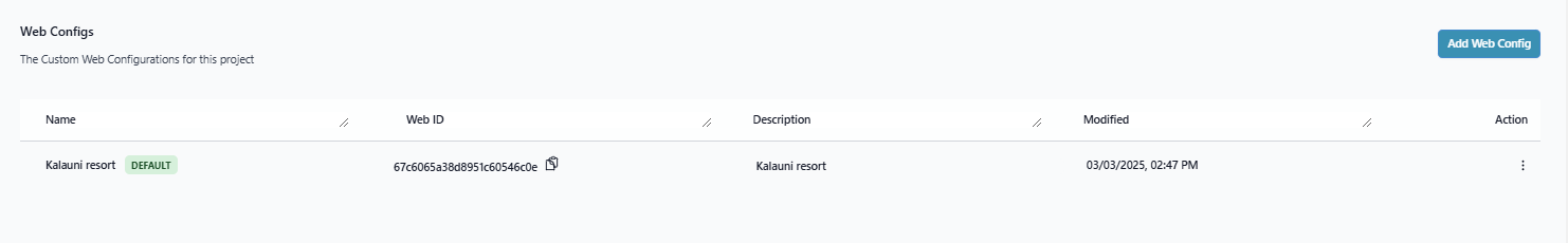
| config-id (Optional) | Load the settings based on config id. | config-id="1234567891" |
The below image will contains the config id.
Privacy Link (Optional)
To include a privacy policy link, use the <privacy> tag with a custom slot within the <ai12z-cta> element:
<ai12z-cta data-key="your_api_key_here">
  <div slot="custom-privacy">
    Privacy Statement
    <a href="https://ai12z.com/privacy-policy/" target="_blank"
      >Click to view</a
    >
  </div>
</ai12z-cta>
CTA (Optional)
If cta tag exists the standard search control will be replaced with the html in the cta tag
<ai12z-cta data-key="your_api_key_here" heading="">
  <div slot="cta">
    <img
      style="width: 20px; cursor: pointer"
      src="https://cdn.ai12z.net/assets/web/magnifying-glass-solid.svg"
      alt="Search"
    />
  </div>
</ai12z-cta>
Custom CSS Properties
| Property | Description | Default |
|---|---|---|
| --ai12z-font-family | Font Family | --ai12z-font-family: "Inter", sans-serif; |
| --ai12z-primary-color | Primary Font color | --ai12z-primary-color: rgb(165 180 252); |
| --ai12z-secondary-color | Secondary Font color | --ai12z-secondary-color: #64748b; |
| --ai12z-button-bgcolor | Bg color of the submit button | --ai12z-button-bgcolor: #007bff;button |
| --ai12z-mic-color | color of the microphone | --ai12z-mic-color: #007bff; |
| --ai12z-font-size | Primary Font size | --ai12z-font-size:16px; |
| --ai12z-font-mute | Font color of the custom message forexample: There is no results. | --ai12z-font-mute: #64748b; |
| --ai12z-heading-color | Customize the heading color like search here | --ai12z-heading-color: #64748b; |
| --ai12z-heading-font-size | Customize the heading font size | --ai12z-heading-font-size:1rem; |
| --ai12z-link-color | --ai12z-link-color: rgb(30 64 175); | Cutomize the color of the anchor tag links |
| --ai12z-link-hover-color | --ai12z-link-hover-color: rgb(59 130 246); | Customize the hover color of the anchor links |
| --ai12z-input-placeholder-color | Customize the placeholder test color of the input field | --ai12z-input-placeholder-color: rgb(148 163 184); |
| --ai12z-input-placeholder-font-size | Customize the font size of the placeholder text in the input field | --ai12z-input-placeholder-font-size:1.1rem; |
| --ai12z-followup-color | Customize the followup label text color | --ai12z-followup-color:rgb(107 114 128); |
| --ai12z-followup-font-size | Customize the font size of the followup text | --ai12z-followup-font-size: 1rem; |
| --ai12z-followup-bg-color | Customize the bg color of the followup checkbox color | --ai12z-followup-bg-color:rgb(30 64 175); |
| --ai12z-border-color | Border color of the input field | --ai12z-border-color: rgba(59, 130, 246, 0.5); |
| --ai12z-hover-button-color | Color of the button when hover | --ai12z-hover-button-color:rgb(165 180 252); |
| --ai12z-hover-bg-color | Color of the list of Search History when hover | --ai12z-hover-bg-color: rgb(249 250 251); |
| --ai12z-bubble-background | Background color of the bubble chat | --ai12z-bubble-background:rgb(241 245 249); |
| --ai12z-feedback-selected | Color of the thumbs when selected | --ai12z-feedback-selected: rgb(55 65 81); |
| --ai12z-feedback-color | Color of the thumbs up and down | --ai12z-feedback-color: rgb(107 114 128); |
| --ai12z-font-description | Font color of the description on the auto search results | --ai12z-font-description:rgb(107 114 128); |
| --ai12z-font-search-text | Font color of the title on the auto search results | --ai12z-font-search-text : #111827; |
| --ai12z-dialog-margin | Position of the modal content | --ai12z-dialog-margin:3rem 0 0 0; |
| --ai12z-category-font-color | Customize the color of the category text | --ai12z-category-font-color: #2a2727; |
| --ai12z-category-font-size | Customize the size of the category text | --ai12z-category-font-size: medium; |
| --ai12z-search-result-title-color | Customize the color of the title which shows in the search results | --ai12z-search-result-title-color: #111827; |
| --ai12z-search-result-title-font-size | Customize the size of the title which shows in the search results | --ai12z-search-result-title-font-size: 0.875rem; |
| --ai12z-search-result-description-color | Customize the color of the description text which shows in the search results | --ai12z-search-result-description-color: rgb(107 114 128); |
| --ai12z-search-result-description-font-size | Customize the size of the description text which shows in the search results | --ai12z-search-result-description-font-size: 0.75rem; |
| --ai12z-bubble-font-color | customize the color of the bubble text | --ai12z-bubble-font-color: rgb(15 23 42); |
| --ai12z-bubble-font-size | Customize the size of the bubble text | --ai12z-bubble-font-size: 1.1rem; |
| --ai12z-button-font-color | Customize the button font color Example: ASK AI | --ai12z-button-font-color: rgb(51 65 85); |
| --ai12z-button-font-size | Customize the button font size | --ai12z-button-font-size: 1rem; |
Passing attributes and tags
Attributes
Developer can pass a dictionary of additional data that can be used in prompts if you include the attribute tag in Answer AI.
IncludeTags
Array of tags, only content with one of these tags will be returned.
ExcludeTags
Array of tags,content will be excluded if it has one of these tags.
Example for passing the attributes,excludeTags and includeTags
        document.addEventListener("DOMContentLoaded", function () {
          const ele = document.querySelector("ai12z-cta")
          if (ele) {
            ele.excludeTags = ["blog"]
            ele.includeTags = []
            ele.dataAttributes = {
              content: {
                newlist: [
                  {
                    _uid: "BUY6Drn9e1",
                    component: "foo",
                    headline: "Foo",
                  },
                  {
                    _uid: "gJZoSLkfZV",
                    component: "bar",
                    title: "Bar",
                  },
                  {
                    _uid: "X1JAfdsZxy",
                    component: "foo",
                    headline: "Another headline",
                  },
                ],
              },
            }
          }
        })
Events
The following events emitted by the component. You can subscribe to these events to execute custom logic in response to specific actions or state changes within the component.
1. errored
Description:
Emitted when an error occurs within the component. This event provides error details that can be used for logging or displaying error messages to the user.
Usage Example:
// Assuming 'myComponent' is a reference to your component
myComponent.addEventListener("errored", (event) => {
  console.error("An error occurred:", event.detail)
})
Explanation:
- Listener: Attach an event listener to the
erroredevent. - Event Object: The callback function receives an
eventobject. - Error Details: Access the error information via
event.detail.
2. buttonClicked
Description:
Emitted when a button within the component is clicked. Useful for triggering actions in response to user interactions.
Usage Example:
myComponent.addEventListener("buttonClicked", (event) => {
  console.log("Button was clicked:", event.detail)
  // You can access additional data from event.detail if provided
})
Explanation:
- User Interaction: Respond to button clicks inside the component.
- Custom Data:
event.detailcontains information about which button was clicked.
3. messageSent
Description:
Emitted when the component sends a message. This can be used to track outgoing messages or to update the UI accordingly.
Usage Example:
myComponent.addEventListener("messageSent", (event) => {
  console.log("Message sent:", event.detail)
  // Update message list or notify other components
})
Explanation:
- Messaging Logic: Useful in chat applications or components that handle communication.
- Event Data:
event.detailcontains the message content or metadata.
4. messageReceived
Description:
Emitted when the component receives a message. Allows you to handle incoming messages and update the interface or state.
Usage Example:
myComponent.addEventListener("messageReceived", (event) => {
  console.log("Message received:", event.detail)
  // Display the message or process it as needed
})
Explanation:
- Incoming Messages: Essential for handling data received from external sources or services.
- Processing Data: Utilize
event.detailto access message content.
5. open
Description:
Emitted when the component is opened. Ideal for setting up resources or initializing state when the component becomes active.
Usage Example:
myComponent.addEventListener("open", () => {
  console.log("Component has been opened.")
  // Initialize data or start animations
})
Explanation:
- Lifecycle Event: Signifies that the component is ready for interaction.
- Initialization: Perform setup tasks when the component opens.
6. close
Description:
Emitted when the component is closed or destroyed. Use this event to perform cleanup tasks or save the component's state.
Usage Example:
myComponent.addEventListener("close", () => {
  console.log("Component has been closed.")
  // Save state or release resources
})
Explanation:
- Cleanup: Ideal for removing event listeners or stopping timers.
- Resource Management: Ensure there are no memory leaks by cleaning up.
Custom Methods
| Method Name | Description | How to use it |
|---|---|---|
| sendMessage | This method allows us to send a message programmatically. It accepts two parameters. Message (Required) – The first parameter must be a string containing the message to be sent to the server to be processed by the ai12z server the React LLM. Display Text (Optional) – The second parameter is optional and should be a string that specifies the display text for the message in the bot bubble. If the second parameter is not provided, the bot bubble will be use the first parameter | const ctaElement = document.querySelector("ai12z-cta"); ctaElement.sendMessage("What are the activities available","List all Activities") |
| sendJSON | This method allows us to send a JSON programmatically. It accepts two parameters. jsonData (Required) – The first parameter must be an object which will be sent to the server to be processed by a12z server React LLM. DisplayText(Required) – The second parameter should be a string that specifies the display text that the bot bubble will show. | const ctaElement=document.querySelector("ai12z-cta");ctaElement.sendJSON({"firstname":"xxxx","lastname":"yyyy","dob":"zzzz"}, "Info submitted"); |
General Usage Notes
- Event Subscription: Use the
addEventListenermethod to subscribe to events emitted by the component. - Event Object: The event listener callback receives an
eventobject, which may contain additional data inevent.detail. - Component Reference: Replace
myComponentwith the actual reference to your component instance.
Example: Subscribing to Multiple Events
// Reference to your component
const myComponent = document.querySelector("my-component")

// onErrored
myComponent.addEventListener("errored", (event) => {
  console.error("Error:", event.detail)
})

// onButtonClicked
myComponent.addEventListener("buttonClicked", (event) => {
  console.log("Button clicked:", event.detail)
})

// onMessageSent
myComponent.addEventListener("messageSent", (event) => {
  console.log("Sent message:", event.detail)
})

// onMessageReceived
myComponent.addEventListener("messageReceived", (event) => {
  console.log("Received message:", event.detail)
})

// onOpen
myComponent.addEventListener("open", () => {
  console.log("Component opened")
})

// onClose
myComponent.addEventListener("close", () => {
  console.log("Component closed")
})
Tips for Handling Events
- Error Handling: Always check if
event.detailexists to avoid undefined errors. - Asynchronous Operations: If you're performing asynchronous tasks within the event handlers, consider using
async/awaitor.then()for Promises. - Unsubscribing Events: If necessary, remove event listeners using
removeEventListenerto prevent memory leaks.
// Removing an event listener
const onOpenHandler = () => {
  console.log("Component opened")
}

myComponent.addEventListener("open", onOpenHandler)

// Later in your code
myComponent.removeEventListener("open", onOpenHandler)
Conclusion
By subscribing to these events, you can effectively interact with the component and respond to its internal actions. This enables a more dynamic and responsive user experience.