Custom Agent - Carousel
Overview and Purpose
The Carousel Control in ai12z provides a visually dynamic and interactive way to present large datasets, bypassing the limitations of relying solely on an LLM for response rendering. While RAG (Retrieval-Augmented Generation) is excellent for answering precise, document-based queries, scenarios like browsing restaurant menus, exploring product catalogs, or selecting movie options often involve extensive datasets that are impractical for the LLM to render from its output due to response latency.
It’s not that the LLM can’t handle large JSON payloads—modern models with 128K context windows can process a substantial amount of input data. The real challenge lies not in input token processing, but in output token generation. Generating large responses incurs latency and cost, which makes rendering many items directly from the LLM inefficient.
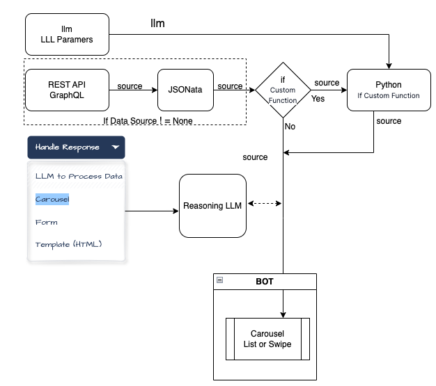
The carousel allows you to bypass LLM output generation entirely for the display layer, handing off large datasets directly to the UI. This dramatically improves responsiveness and cost efficiency, while still enabling you to optionally use the LLM for summary, comparison, or contextualization without overburdening it.
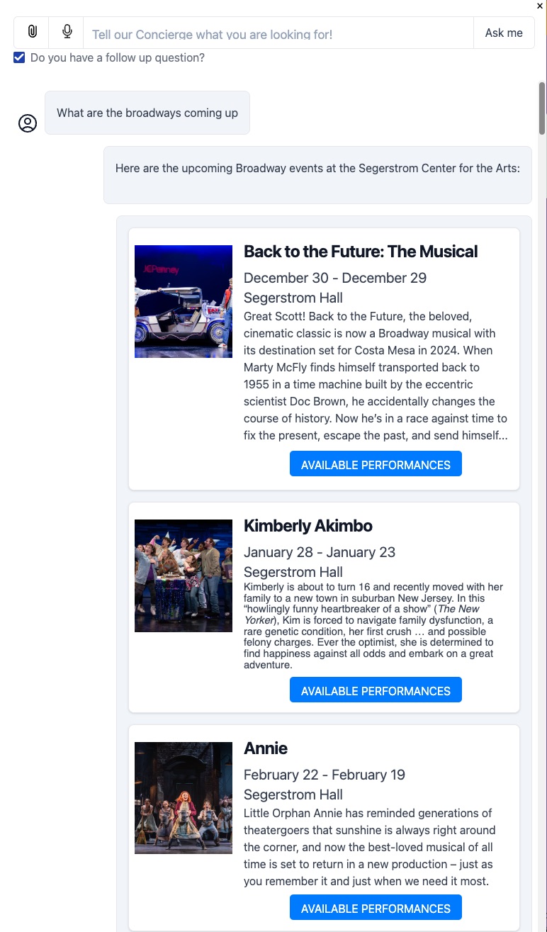
Below are eight reasons why you might incorporate a Carousel into your ai12z copilot interface. These examples highlight both user experience enhancements and strategic business objectives, including e-commerce scenarios with data sourced from APIs (REST or GraphQL) such as Shopify’s GraphQL endpoints.
Block Diagram
-
Visually Rich Product Browsing:
Instead of returning a long text list of products, a carousel can present items with images, titles, and short descriptions in a visually appealing, swipeable interface. For instance, when querying a Shopify GraphQL endpoint for “women’s summer dresses,” the copilot can return a carousel of dresses along with their images, prices, and brief details, letting users quickly scan and select the one they like. -
Curated Recommendations & Upsells:
A carousel makes it easy to highlight products related to a user’s query—such as accessories to match a previously viewed item. With data fetched from a REST API, the copilot can show a rotating carousel of recommended items, allowing the user to visually compare options and discover complementary purchases without sifting through multiple pages. -
Location-Based Listings (e.g., Restaurants, Hotels):
For a user asking for “restaurants near my hotel,” the copilot can fetch geo-specific data from a RESTful location service and return a carousel of restaurant images, short descriptions, cuisines, and links to menus. The user can swipe through the results and pick one that looks appealing, enhancing overall convenience and decision-making. -
Interactive Product Customization:
By embedding forms or selection fields inside the carousel panels, users can customize their product options (e.g., selecting size, color, or adding gift wrapping) before finalizing their purchase. With Shopify GraphQL, for example, you could fetch product variants in real-time and present them in a carousel format, letting the user pick from multiple styles in a visually engaging manner. -
Category & Collection Showcases:
If a user requests “Show me the new arrivals,” the copilot can query a GraphQL API for a store’s latest collection and return a carousel of featured products. Each carousel card might include product images, pricing tiers, and quick-add-to-cart buttons, helping users rapidly explore fresh inventory and boosting engagement with new releases. -
Event Listings & Ticket Booking:
Suppose the user asks for upcoming concerts or shows. The copilot can pull event data from a REST endpoint and display them in a carousel, each with an “available performances” button that opens a panel showing specific dates and seat selection forms. This visual, step-by-step approach simplifies complex workflows (like ticket bookings) and creates a more guided, user-friendly experience. -
Personalized Recommendations Using User Parameters:
The carousel can leverage user parameters or preferences (e.g., dietary restrictions, preferred price range, or style preferences) to filter results before display. For example, if the user mentions they’re vegan, a Shopify GraphQL query can return only vegan-friendly products, arranged in a carousel for easy scanning. Personalized, visually driven recommendations encourage faster conversions and reduce decision fatigue. -
Rapid Comparison of Multiple Options:
When a user says, “Show me options for [X],” returning a carousel enables them to quickly compare multiple items side-by-side without needing to read through long descriptions. For instance, if they’re researching different laptop models pulled from a REST endpoint, a carousel can present each model’s key specs, price, and warranty at a glance. Users can then swipe through and pick the one that fits best, providing an efficient and enjoyable shopping or decision-making experience.
In essence, the Carousel Control in ai12z transforms raw data into a visually navigable, interactive interface, streamlining product discovery, enhancing user interaction, and ultimately improving the user’s overall journey—whether they’re browsing inventory, booking services, or exploring personalized recommendations.
Parameters
See the Edit Parameter dialog below:
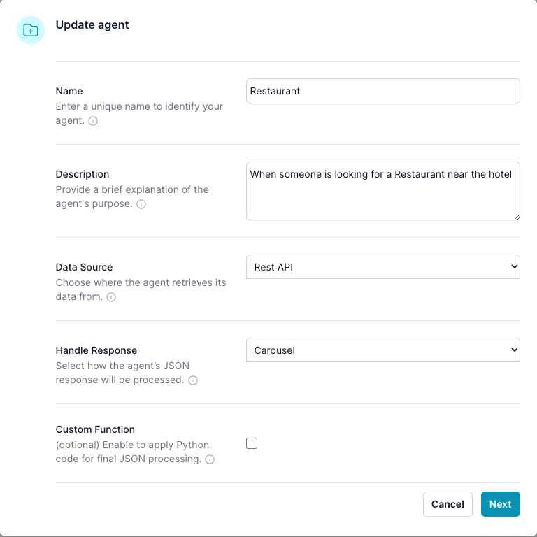
In the Edit Parameter dialog it will define what will show up in this Edit Agent dialog.
For this example, we set the Handle Response -> Carousel, and Source -> Rest API, Enable Custom Function -> false
Edit Agent dialog
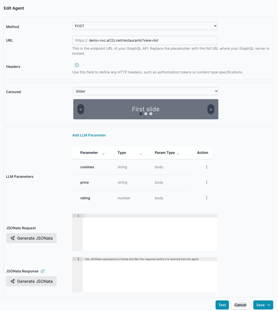
There are 3 types of Carousels
List, Slider and Custom
List
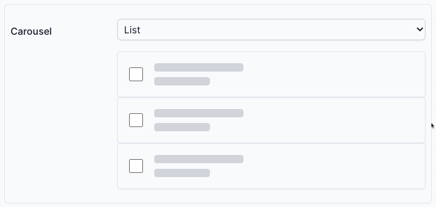
A vertically scrollable carousel where each item is displayed one after another in a list format. The user can simply scroll down through the content to view additional items. This layout is best suited when there are many items, and vertical space is readily available.
Slider

A horizontally swipable carousel that shows one primary item (or a few items) at a time, allowing the user to swipe left or right to navigate through content. Ideal for image galleries, product highlights, or other scenarios where you want to emphasize one item at a time.
List and Slider - Carousel Data Structure
The List and Slider Carousel Data Structure is a flexible format for representing data-rich content in a carousel or list layout. It supports various use cases, including product showcases, interactive forms, and detailed descriptions.
Key Properties
-
items(required): An array of objects, where each object represents a single carousel item. Properties include:title(string): The main title of the item.subTitle(array of strings): Supplementary information displayed under the title.images(array of URLs): Images associated with the item.shortDescription(string or HTML): A brief description of the item.description(string or HTML): A detailed description that complementsshortDescription.buttons(array): Interactive elements like links or actions. Each button includes:label(string): Button text.data-type(url | panel | query): Defines the button's action.data-url(string): Used whentype = url.
form(object): Defines a form structure with fields for user input.theme(string):panels(optional): An array of panels providing additional views or interactions. Each panel supports the above properties but does not include nesteditems.
-
hideImageOnMore(boolean): Determines whether the image is hidden when the full description is expanded. -
process(string): OverridesHandle Responsesetting - the endpoint can override configuration by returning process:carousel: Display the results in the carousel, bypassing LLM output. No input token cost created by endpoint data. This is the default.LLM: Use the language model to generate a response. Useful when no results are returned.both: Display the carousel and let the LLM add narrative context or comparison. Endpoint data is being sent to both the LLM and to the client carousel. Using the LLM to explain information that is in the carousel
This hybrid approach combines the efficiency of structured display with the flexibility of natural language. Remember: Input token don't increase the time, the issue—it’s the time and cost of generating output tokens when LLM has to render all the data. Carousels help you stay responsive, while still allowing rich interaction powered by the LLM.
If you're unsure which process mode to use, start with carousel for data-rich queries. Add both if the LLM can add contextual value (e.g., summarizing, comparing, explaining results). Only use LLM alone when visual display is unnecessary.
Examples
** Simple Carousel**
{
  "items": [
    {
      "images": ["https://example.com/image.jpg"],
      "shortDescription": "A brief description.",
      "subTitle": ["Category", "Price $10"],
      "title": "Sample Item"
    }
  ]
}
** Carousel with Panel and Form**
{
  "items": [
    {
      "title": "Event",
      "buttons": [{ "label": "View Details", "type": "panel" }],
      "panels": [
        {
          "title": "Event Details",
          "form": { ... }
        }
      ]
    }
  ],
  "process": "both"
  "theme": '{"themeName":"sharp","colorPalette":"light","isPanelless":true,"backgroundImage":"","backgroundOpacity":1,"backgroundImageAttachment":"scroll","backgroundImageFit":"cover","cssVariables":{"--sjs-corner-radius":"4px","--sjs-base-unit":"8px","--sjs-shadow-small":"0px 0px 0px 1px rgba(0, 0, 0, 0.2)","--sjs-shadow-inner":"0px 0px 0px 1px rgba(0, 0, 0, 0.25)","--sjs-border-default":"rgba(0, 0, 0, 0.25)","--sjs-border-light":"rgba(0, 0, 0, 0.25)","--sjs-general-backcolor":"rgba(255, 255, 255, 1)","--sjs-general-backcolor-dark":"rgba(228, 228, 228, 1)","--sjs-general-backcolor-dim-light":"rgba(238, 238, 238, 1)","--sjs-general-backcolor-dim-dark":"rgba(220, 220, 220, 1)","--sjs-general-forecolor":"rgba(0, 0, 0, 0.91)","--sjs-general-forecolor-light":"rgba(0, 0, 0, 0.6)","--sjs-general-dim-forecolor":"rgba(0, 0, 0, 0.91)","--sjs-general-dim-forecolor-light":"rgba(0, 0, 0, 0.6)","--sjs-secondary-backcolor":"rgba(255, 152, 20, 1)","--sjs-secondary-backcolor-light":"rgba(255, 152, 20, 0.1)","--sjs-secondary-backcolor-semi-light":"rgba(255, 152, 20, 0.25)","--sjs-secondary-forecolor":"rgba(255, 255, 255, 1)","--sjs-secondary-forecolor-light":"rgba(255, 255, 255, 0.25)","--sjs-shadow-small-reset":"0px 0px 0px 0px rgba(0, 0, 0, 0.2)","--sjs-shadow-medium":"0px 2px 6px 0px rgba(0, 0, 0, 0.1)","--sjs-shadow-large":"0px 8px 16px 0px rgba(0, 0, 0, 0.1)","--sjs-shadow-inner-reset":"0px 0px 0px 0px rgba(0, 0, 0, 0.25)","--sjs-border-inside":"rgba(0, 0, 0, 0.16)","--sjs-special-red-forecolor":"rgba(255, 255, 255, 1)","--sjs-special-green":"rgba(25, 179, 148, 1)","--sjs-special-green-light":"rgba(25, 179, 148, 0.1)","--sjs-special-green-forecolor":"rgba(255, 255, 255, 1)","--sjs-special-blue":"rgba(67, 127, 217, 1)","--sjs-special-blue-light":"rgba(67, 127, 217, 0.1)","--sjs-special-blue-forecolor":"rgba(255, 255, 255, 1)","--sjs-special-yellow":"rgba(255, 152, 20, 1)","--sjs-special-yellow-light":"rgba(255, 152, 20, 0.1)","--sjs-special-yellow-forecolor":"rgba(255, 255, 255, 1)","--sjs-article-font-xx-large-textDecoration":"none","--sjs-article-font-xx-large-fontWeight":"700","--sjs-article-font-xx-large-fontStyle":"normal","--sjs-article-font-xx-large-fontStretch":"normal","--sjs-article-font-xx-large-letterSpacing":"0","--sjs-article-font-xx-large-lineHeight":"64px","--sjs-article-font-xx-large-paragraphIndent":"0px","--sjs-article-font-xx-large-textCase":"none","--sjs-article-font-x-large-textDecoration":"none","--sjs-article-font-x-large-fontWeight":"700","--sjs-article-font-x-large-fontStyle":"normal","--sjs-article-font-x-large-fontStretch":"normal","--sjs-article-font-x-large-letterSpacing":"0","--sjs-article-font-x-large-lineHeight":"56px","--sjs-article-font-x-large-paragraphIndent":"0px","--sjs-article-font-x-large-textCase":"none","--sjs-article-font-large-textDecoration":"none","--sjs-article-font-large-fontWeight":"700","--sjs-article-font-large-fontStyle":"normal","--sjs-article-font-large-fontStretch":"normal","--sjs-article-font-large-letterSpacing":"0","--sjs-article-font-large-lineHeight":"40px","--sjs-article-font-large-paragraphIndent":"0px","--sjs-article-font-large-textCase":"none","--sjs-article-font-medium-textDecoration":"none","--sjs-article-font-medium-fontWeight":"700","--sjs-article-font-medium-fontStyle":"normal","--sjs-article-font-medium-fontStretch":"normal","--sjs-article-font-medium-letterSpacing":"0","--sjs-article-font-medium-lineHeight":"32px","--sjs-article-font-medium-paragraphIndent":"0px","--sjs-article-font-medium-textCase":"none","--sjs-article-font-default-textDecoration":"none","--sjs-article-font-default-fontWeight":"400","--sjs-article-font-default-fontStyle":"normal","--sjs-article-font-default-fontStretch":"normal","--sjs-article-font-default-letterSpacing":"0","--sjs-article-font-default-lineHeight":"28px","--sjs-article-font-default-paragraphIndent":"0px","--sjs-article-font-default-textCase":"none","--sjs-general-backcolor-dim":"rgba(255, 255, 255, 1)","--sjs-primary-backcolor":"rgba(103, 58, 176, 1)","--sjs-primary-backcolor-dark":"rgba(69, 24, 142, 1)","--sjs-primary-backcolor-light":"rgba(103, 58, 176, 0.1)","--sjs-primary-forecolor":"rgba(255, 255, 255, 1)","--sjs-primary-forecolor-light":"rgba(255, 255, 255, 0.25)","--sjs-special-red":"rgba(229, 10, 62, 1)',"--sjs-special-red-light":"rgba(229, 10, 62, 0.1)"},"headerView":"basic"}'
}
Code to add to the html page for form submission
Add javascript to the page you insert the ai12z control
<script>
      document.addEventListener("DOMContentLoaded", function () {
        document
          .querySelector("ai12z-cta")
          .addEventListener("formSubmitted", (data) => {
            console.log("formSubmitted", data);
            openUrl(data.detail.SelectPerformance);
          });
      });
      function openUrl(id) {
        url = "https://seats.scfta.org/single?id=" + id;
        window.open(url, "_blank");
      }
    </script>
Using Custom Carousel
The data format is up to you, using handle bar, you can assign any item to your custom html
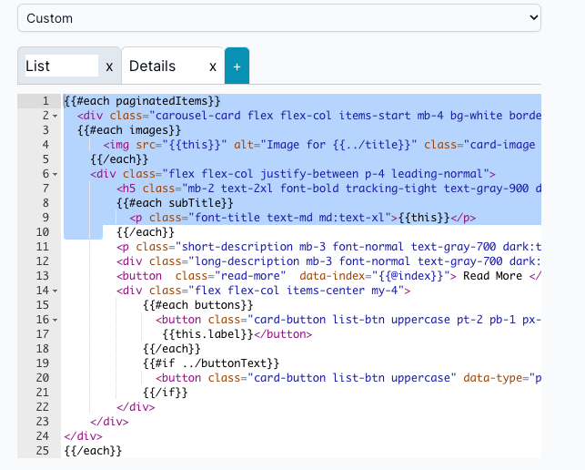
- A fully configurable carousel that allows you to create unique panel templates and pair them with specific data sources. With this approach, each panel can be designed and laid out according to your needs, enabling complex, highly customized displays that go beyond standard list or slider patterns.
Custom:
The Carousel Controls accepts structured data to display a series of interactive items, each potentially with multiple panels, forms, images, and detailed content. Each item can include titles, images, descriptions, forms, and buttons with various functions. Below is a comprehensive guide on how to pass data to the Carousel Control and define the behavior of the interactive elements.
Custom List
Item list View
{{#each items}}
<div
  class="carousel-card flex flex-col items-start mb-4 bg-white border h-auto border-gray-200 rounded-lg shadow md:flex-row md:max-w-xl  dark:border-gray-700"
  data-index="{{@index}}"
>
  {{#each images}}
  <img
    src="{{this}}"
    alt="Image for {{../title}}"
    class="card-image object-cover h-96 md:mt-6 md:ml-2"
    style="width:25%;height:25%"
  />
  {{/each}}
  <div class="flex flex-col justify-between p-4 leading-normal">
    <h5
      class="mb-2 text-2xl font-bold tracking-tight text-gray-900 dark:text-white"
    >
      {{{this.title}}}
    </h5>
    {{#each subTitle}}
    <p class="font-title text-md md:text-xl">{{this}}</p>
    {{/each}}
    <p
      class="short-description mb-3 font-normal text-gray-700 dark:text-gray-400"
    >
      {{{this.shortDescription}}}
    </p>
    <div
      class="long-description mb-3 font-normal text-gray-700 dark:text-gray-400 hidden"
    >
      {{{this.description}}}
    </div>
    <button class="read-more" data-index="{{@index}}">Read More</button>
    <div class="flex flex-col items-center my-4">
      {{#each buttons}}
      <button
        class="card-button list-btn uppercase pt-2 pb-1 px-4 flex-grow hover:bg-gradient-to-t md:flex-none"
        data-id="{{@index}}"
        data-url="{{this.url}}"
        data-type="{{this.type}}"
      >
        {{this.label}}
      </button>
      {{/each}} {{#if ../buttonText}}
      <button class="card-button list-btn uppercase" data-type="panel">
        {{../buttonText}}
      </button>
      {{/if}}
    </div>
  </div>
</div>
{{/each}}
Detail View
<div class="flex flex-col items-center justify-center w-full h-full p-4">
  <div class="w-full md:col-span-2 h-fit">
    <dynamic-form form="{{json form}}" formSettings="{{json formSettings}}" />
  </div>
  <div>
    {{#each buttons}}
    <button
      class="panel-button list-btn text-white"
      data-id="{{this.index}}"
      data-type="{{this.type}}"
    >
      {{this.label}}
    </button>
    {{/each}}
  </div>
</div>
Custom Slider
Item list view
<div id="carouselExample" class="relative w-full" data-carousel="static">

            <div class="carousel-box relative bg-white overflow-hidden overflow-y-scroll h-56 rounded-lg md:h-96" style={ overflowY: "scroll", height: "30rem" }>
              {{#each items}}
                  <div class="carousel-card max-w-sm hidden duration-700 ease-in-out md:max-w-xl" data-carousel-item id="carousel-item-{{@index}}" data-index="{{@index}}">
                    {{#each images}}
                      <a href="#">
                          <img class="card-image w-full h-56 object-cover" src="{{this}}" alt="Image for {{../title}}" />
                      </a>
                    {{/each}}
                  <div class="p-5">
                      <a href="#">
                          <h5 class="mb-2 text-2xl font-bold tracking-tight text-gray-900 dark:text-white">{{{title}}}</h5>
                      </a>
                      <p class="short-description mb-3 font-normal text-gray-700 dark:text-gray-400">{{{shortDescription}}}</p>
                      <div class="long-description mb-3 font-normal text-gray-700 dark:text-gray-400 hidden">{{{description}}}</div>
                      <a class="read-more inline-flex items-center px-3 py-2 text-sm font-medium text-center text-white bg-blue-700 rounded-lg hover:bg-blue-800 focus:ring-4 focus:outline-none focus:ring-blue-300 dark:bg-blue-600 dark:hover:bg-blue-700 dark:focus:ring-blue-800">
                          Read more
                          <svg class="rtl:rotate-180 w-3.5 h-3.5 ms-2" aria-hidden="true" xmlns="http://www.w3.org/2000/svg" fill="none" viewBox="0 0 14 10">
                              <path stroke="currentColor" stroke-linecap="round" stroke-linejoin="round" stroke-width="2" d="M1 5h12m0 0L9 1m4 4L9 9"/>
                          </svg>
                      </a>
                      {{#each buttons}}
                      <button class="card-button list-btn uppercase pt-2 pb-1 px-4 flex-grow hover:bg-gradient-to-t md:flex-none" data-index="{{@index}}" data-url="{{this.url}}" data-type="{{this.type}}">{{this.label}}</button>
                      {{/each}}
                  </div>
                </div>
              {{/each}}
            </div>

        <div class="absolute z-30 flex overflow-x-auto -translate-x-1/2 space-x-1 rtl:space-x-reverse bottom-5 left-1/2 scrollbar-visible">
        {{#if (lte items.length 5)}}
          {{#each items}}
              <button
                  id="carousel-indicator-{{@index}}"
                  type="button"
                  class="w-2.5 h-2.5 sm:w-3 sm:h-3 md:w-4 md:h-4 rounded-full"
                  aria-current="true"
                  aria-label="Slide {{@index}}"
              ></button>
          {{/each}}
        {{/if}}
      </div>

  <!-- Controls -->
  <button
    type="button"
    class="absolute top-0 left-0 z-30 flex items-center justify-center h-full px-4 cursor-pointer group focus:outline-none"
    id="data-carousel-prev"
    data-carousel-prev
  >
    <span
      class="inline-flex items-center justify-center w-10 h-10 rounded-full bg-blue-600"
    >
      <svg
        aria-hidden="true"
        class="w-6 h-6 text-white"
        fill="none"
        stroke="currentColor"
        viewBox="0 0 24 24"
        xmlns="http://www.w3.org/2000/svg"
      >
        <path
          stroke-linecap="round"
          stroke-linejoin="round"
          stroke-width="2"
          d="M15 19l-7-7 7-7"
        ></path>
      </svg>
      <span class="sr-only">Previous</span>
    </span>
  </button>
  <button
    type="button"
    class="absolute top-0 right-0 z-30 flex items-center justify-center h-full px-4 cursor-pointer group focus:outline-none"
    id="data-carousel-next"
    data-carousel-next
  >
    <span
      class="inline-flex items-center justify-center w-10 h-10 rounded-full bg-blue-600"
    >
      <svg
        aria-hidden="true"
        class="w-6 h-6 text-white dark:text-gray-800"
        fill="none"
        stroke="currentColor"
        viewBox="0 0 24 24"
        xmlns="http://www.w3.org/2000/svg"
      >
        <path
          stroke-linecap="round"
          stroke-linejoin="round"
          stroke-width="2"
          d="M9 5l7 7-7 7"
        ></path>
      </svg>
      <span class="sr-only">Next</span>
    </span>
  </button>
</div>
Detail View
<div class="flex flex-col items-center justify-center w-full h-full p-4">
  <div class="w-full md:col-span-2 h-fit">
    <dynamic-form form="{{json form}}" formSettings="{{json formSettings}}" />
  </div>
  <div>
    {{#each buttons}}
    <button
      class="panel-button list-btn text-white"
      data-id="{{this.index}}"
      data-type="{{this.type}}"
    >
      {{this.label}}
    </button>
    {{/each}}
  </div>
</div>
Custom Template with buttons
The ai12zBot is the global variable which will contains the bot dom element and the ai12zCta is the global variable which will contains the cta dom element.
Those DOM element contians the global functions such as sendJSON and sendMessage.If isBot variable is true, then we can access the ai12zBot dom element.If isBot variable is false, then we can access the ai12zCta dom element.
<div class="flex">
  {{#if ../isBot }}
  <button
    class="card-button list-btn uppercase"
    onclick='ai12zBot.sendJSON({"firstname": "John", "lastname": "Doe","dob": "1990-01-01"},"Info submitted")'
  >
    User Information
  </button>
  <button
    class="card-button list-btn uppercase"
    onclick='ai12zBot.sendMessage("User information submitted","Info submitted")'
  >
    User Information
  </button>

  {{else}}
  <button
    class="card-button list-btn uppercase"
    onclick='ai12zCta.sendJSON({"firstname": "John", "lastname": "Doe","dob": "1990-01-01"},"Info submitted")'
  >
    User Information
  </button>
  <button
    class="card-button list-btn uppercase"
    onclick='ai12zCta.sendMessage("User information submitted","Info submitted")'
  >
    User Information
  </button>
  {{/if}}
</div>