Edit the Form
The ai12z Form Editor gives you two powerful ways to build forms: a drag-and-drop visual designer for hands-on control, and Vibe Coding — an AI-powered experience where you describe the form you want in plain language and the AI builds or updates the underlying JSON model for you. Both approaches work with the same form engine, so you can freely mix and match.
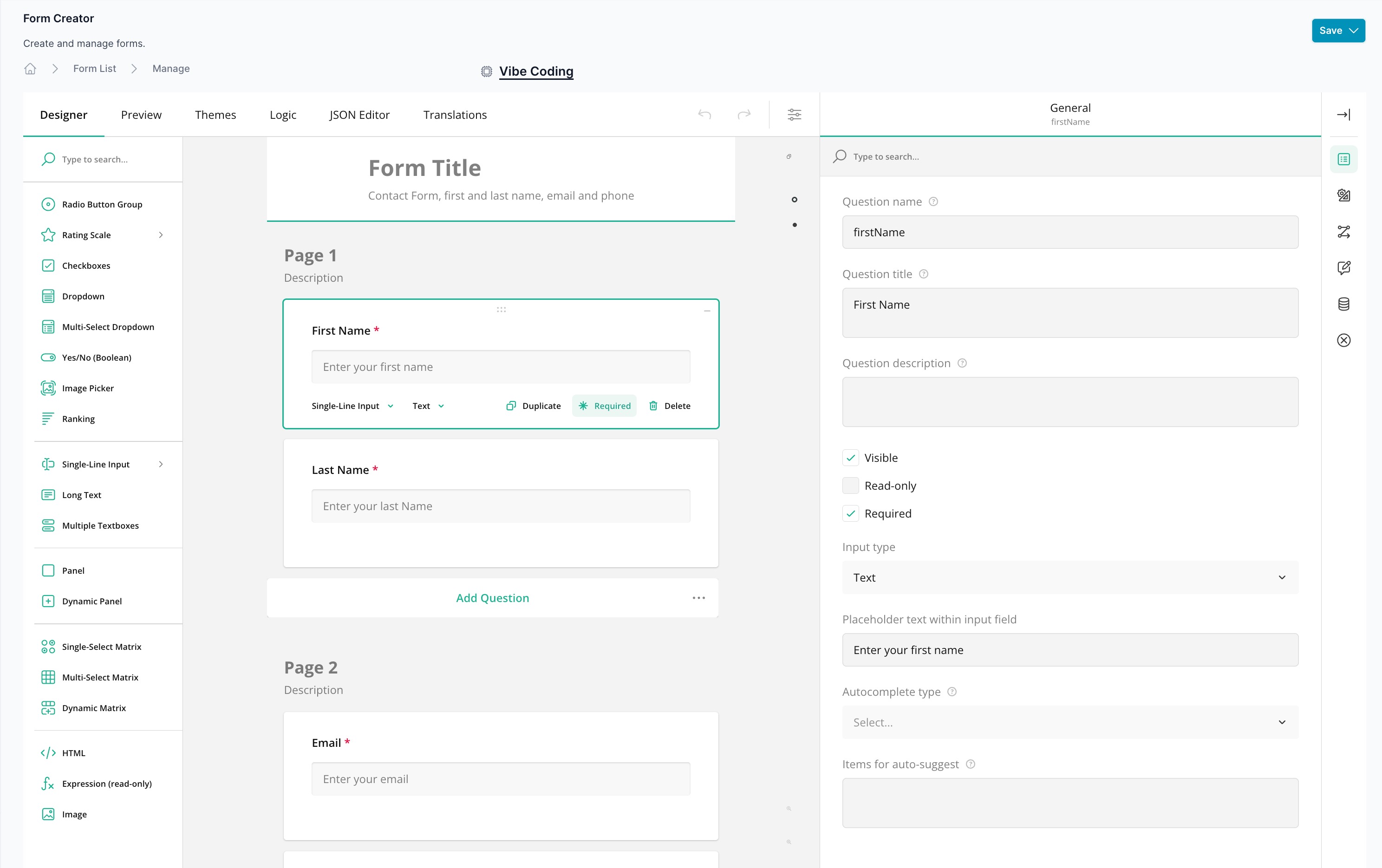
Form Editor Interface
The Form Editor consists of three main sections:
Left Sidebar: Form Controls
The left sidebar contains all available form controls that you can drag and drop onto your form canvas. Available controls include:
- Radio Button Group: Single choice selection from multiple options
- Rating Scale: Star ratings or numerical scales
- Checkboxes: Multiple choice selections
- Dropdown: Single selection from a dropdown list
- Multi-Select Dropdown: Multiple selections from a dropdown
- Yes/No (Boolean): Simple true/false questions
- Image Picker: Visual selection with images
- Ranking: Order items by preference
- Single-Line Input: Short text input fields
- Long Text: Multi-line text areas
- Multiple Textboxes: Multiple related text inputs
- Panel: Group related questions together
- Dynamic Panel: Repeatable question groups
- Single-Select Matrix: Grid with single selections per row
- Multi-Select Matrix: Grid with multiple selections per row
- Dynamic Matrix: Editable data grid
- HTML: Custom HTML content
- Expression (read-only): Calculated or dynamic text
- Image: Display images within the form
Center Canvas: Form Designer
The center canvas is where you build your form by dragging controls from the left sidebar. Features include:
- Drag and Drop: Click and drag any control from the left sidebar onto the canvas
- Form Title: Edit the main form title and description at the top
- Page Management: Organize your form into multiple pages
- Visual Preview: See exactly how your form will appear to users
- Section Headers: Add "Contact Sales" or other section titles to group questions
- Field Configuration: Click any field to configure its properties in the right panel
Right Sidebar: Properties Panel
The right sidebar displays properties for the selected element. Use tabs at the top to access different configuration options:
General Tab
Configure the overall form settings:
- Survey title: The main heading displayed at the top of the form
- Survey description: Explanatory text shown below the title
- Make the title and description visible: Toggle visibility of header content
- Make the survey read-only: Prevent editing of form responses
- Select a Survey language: Choose from available languages (Default: English)
- Limit to one response: Restrict users to submitting the form only once
- Survey width mode: Choose between Auto, Static, or Responsive layouts
Designer Tab
Build and structure your form:
- Add, remove, and reorder questions
- Configure field properties (labels, placeholders, validation rules)
- Set required fields
- Add conditional logic and skip patterns
- Configure field types and options
Preview Tab
Test your form as it will appear to users in real-time without saving changes.
Themes Tab
Customize the visual appearance of your form:
- Select from pre-built themes
- Customize colors, fonts, and spacing
- Apply your brand's visual identity
- Preview theme changes instantly
Logic Tab
Set up advanced form behavior:
- Conditional visibility rules
- Skip logic based on answers
- Dynamic defaults
- Field calculations and expressions
JSON Editor Tab
For advanced users, directly edit the form's JSON structure for precise control over all form properties.
Translations Tab
Manage multi-language support:
- Add translations for all form text
- Support multiple languages simultaneously
- Set default language
- Users can switch languages via the language selector
Working with Form Controls
Adding Controls
- Locate the desired control in the left sidebar
- Click and drag it onto the canvas
- Drop it in the desired position within your form
Configuring Control Properties
- Click any control on the canvas to select it
- The right sidebar will display the control's properties
- Edit properties such as:
- Name: Internal field name for data capture
- Title: Label displayed to users
- Description: Help text or additional context
- Required: Make the field mandatory
- Placeholder: Hint text within the input
- Validation: Set rules for acceptable responses
- Choices: Define options for dropdowns, radio buttons, and checkboxes
You shoul avoid doing this
{
  "type": "radiogroup",
  "name": "question1",
  "choices": [
    {
      "value": "Item 1",
      "text": "Red"
    },
    {
      "value": "Item 2",
      "text": "YelloW"
    },
    {
      "value": "Item 3",
      "text": "Green"
    }
  ]
}
This is the appropriate way to define a control.
{
  "type": "radiogroup",
  "name": "favoriteColor",
  "choices": [
    {
      "value": "red",
      "text": "Red"
    },
    {
      "value": "yellow",
      "text": "YelloW"
    },
    {
      "value": "green",
      "text": "Green"
    }
  ]
}
The second example uses a descriptive "name" that is suitable for the LLM, while the first example uses a generic "name" that does not provide meaningful context for the captured data.
Reordering and Organizing
- Drag controls up or down on the canvas to reorder them
- Use panels to group related questions
- Create multiple pages for longer forms
- Add section headers to organize content visually
Language Translation
The form editor supports multi-language forms:
- Navigate to the Translations tab in the top menu
- Add new languages to your form
- Provide translations for all form text (titles, questions, options, buttons)
- Users will see a language selector in the General settings panel
- When viewing the form, users can switch between available languages
Theme Customization
Personalize your form's appearance:
- Click the Themes tab in the top menu
- Browse available pre-built themes
- Select a theme to apply it instantly
- Customize colors, fonts, and styling to match your brand
- Preview changes in real-time
- Save your custom theme for reuse across multiple forms
Best Practices
- Keep it simple: Use clear, concise labels for all fields
- Group related questions: Use panels or pages to organize complex forms
- Provide context: Add descriptions to help users understand what's needed
- Test thoroughly: Use the Preview tab to test form flow and validation
- Consider mobile users: Choose responsive width mode for mobile-friendly forms
- Use validation: Set appropriate validation rules to ensure data quality
- Optimize language: Provide translations for international audiences
Saving Your Form
Click the Save button in the top-right corner to save as draft or publish the form design. The form will be available for use in your ai12z assistant immediately after saving as published, it will not be availabe if saved as draft.
Vibe Coding
Vibe Coding is an AI-powered way to build and modify forms using plain language instructions. Instead of manually configuring controls and properties, you describe what you want and the AI generates or updates the JSON model that powers your form — the same JSON you can view and edit directly in the JSON Editor tab.
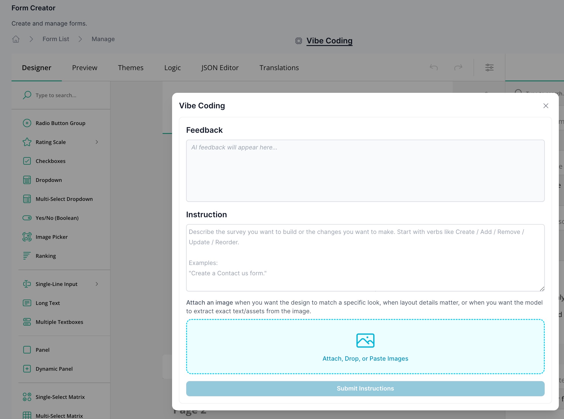
How It Works
Describe the survey or form you want to build, or describe the changes you want to make. The AI interprets your instructions and produces the complete Form JSON model, which is then loaded into your form. You can review the result in the JSON Editor tab, continue refining with more instructions, or switch to the visual Designer to make further tweaks.
Start your instructions with action verbs like Create, Add, Remove, Update, or Reorder to get the clearest results.
Example Instructions
Building a new form:
"Create a Contact Us form."
"Create a customer feedback survey with 5 questions: rating (1–5), what went well, what to improve, email (optional), consent checkbox."
Adding or modifying questions:
"Add a required 'Email' question with validation and a helpful error message."
"Add conditional logic: if rating ≤ 2, show a 'What went wrong?' comment box."
"Convert the 'products' dropdown into a checkbox list and randomize choices."
Structuring and layout:
"Add a 2-step form: Contact Info → Details, with a progress bar."
"Enforce: show one question per page and disable the Complete button until required fields are valid."
"Reorder the questions so 'Email' comes after 'Name'."
Feedback-only mode:
If you want the AI to review your form without making changes:
"Feedback only: review this model for UX, validation, and accessibility."
Vibe Coding and the JSON Editor
Every instruction you submit through Vibe Coding creates or updates the form's underlying JSON model. You can open the JSON Editor tab at any time to:
- Review exactly what the AI generated
- Make precise manual edits
- Copy the model for use elsewhere
- Paste in an existing Form JSON to continue editing with AI assistance
Vibe Coding and the JSON Editor work together — changes made in one are immediately reflected in the other.
Tips for Best Results
- Be specific — the more detail you provide, the better the output. Include question types, validation rules, and any conditional logic.
- Iterate — start with a broad instruction, then follow up with targeted refinements.
- Use Feedback-only mode to audit an existing form before making changes.
- Combine with the visual designer — use Vibe Coding to scaffold the structure, then fine-tune in the Designer tab.