Configuration
Overview
The <search-result-page> component is designed for traditional search page implementations where the search interface is embedded directly into a dedicated page (e.g., /search or /search-results). Unlike modal dialogs, this component provides a full-page search experience with AI-powered results, categorized content, and quick answer buttons.
Typical Use Case: Create a dedicated search page at www.example.com/search where users land after entering a query from a search box elsewhere on your site.
Key Features
- URL Parameter Support: Automatically reads search queries from URL parameters (e.g.,
?searchText=Can+you+wash+your+clothes) - Real-Time Search Results: As users type, displays categorized results with titles and descriptions in the right column, allowing navigation without clicking submit
- Flexible Input Options: Audio input, image upload, and text search
- AI Overview: Displays AI-generated summaries at the top of search results
- Quick Answer Buttons: Pre-configured question buttons for common queries
- As you type results: Results organized by category (e.g., Safety Gear, Seasonal Gear Guides, Layered Apparel, Cold Weather Gear) links to pages without asking AI.
- Mobile Optimized: Responsive design that adapts to any screen size
- Complete Control: Custom CSS and JavaScript for full design control
Why Use a Dedicated Search Page?
The <search-result-page> component is ideal for implementing traditional search functionality where users expect a full-page experience:
1. Traditional Site Search
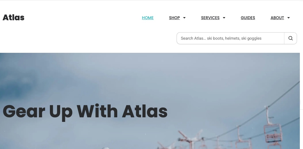
Users enter a query in a search box (in your header or sidebar), and are directed to a dedicated search page that displays results. The component automatically reads the query from the URL parameter.
Example Implementation:
<!-- Search form on any page -->
<form action="/search" method="get">
  <input
    type="text"
    name="searchText"
    placeholder="Search Atlas... ski boots, helmets, ski goggles"
  />
  <button type="submit">Search</button>
</form>

<!-- On /search page -->
<search-result-page
  data-key="YOUR_API_KEY"
  config-id="68c76887ff56ea304ecb7d55"
>
</search-result-page>
Result: User submits "ski boot sizing" → redirected to /search?searchText=ski+boot+sizing → AI results appear automatically
2. E-commerce Product Search
Create a dedicated search results page for your online store. Users can search for products and get AI-powered recommendations along with traditional product listings.
Example URL: www.atlasstore.com/search?searchText=beginner+ski+boots+under+400
Features:
- AI overview at top: "Here are the best beginner ski boots under $400..."
- Categorized results: Boots by brand, price range, or skill level
- Quick answer buttons: "Shop goggles", "Shop Helmets", "Gear rentals"
3. Documentation or Help Center Search
Build a knowledge base search page where users can find articles, guides, and get AI-generated answers to their questions.
Example: docs.example.com/search?searchText=How+do+I+clean+my+skis
4. Multi-Step Search Flows
Use wizards or forms to collect user preferences, then redirect to the search page with a constructed query:
// Product finder wizard collects preferences
const userPreferences = {
  activity: "all-mountain skiing",
  experience: "intermediate",
  budget: "$500-$800",
}

// Construct query and redirect to search page
const query = `Recommend ${userPreferences.activity} equipment for ${userPreferences.experience} skier, budget ${userPreferences.budget}`
window.location.href = `/search?searchText=${encodeURIComponent(query)}`
5. Link-Based Quick Searches
Add quick search links throughout your site that redirect users to pre-populated searches:
<!-- Link from product page -->
<a href="/search?searchText=How+to+wash+and+care+for+ski+jacket"
  >Care Instructions</a
>

<!-- Link from guide article -->
<a href="/search?searchText=storing+skis+and+snowboards+for+off+season"
  >Storage Tips</a
>
Common Use Cases:
- E-commerce stores: Product search and discovery
- Content websites: Article and blog search
- Documentation sites: Knowledge base and help content
- Community forums: Topic and discussion search
- Corporate websites: Company information and resources
The <search-result-page> provides a familiar, full-page search experience while leveraging AI to enhance result quality and provide intelligent overviews.
Managing Configurations
Creating a New Configuration
To create a new Search Result Page configuration:
- Navigate to your Agent dashboard
- Select Web Controls from the left navigation panel
- Click on
<search-result-page> - Click the Add Search Result Config button in the top right
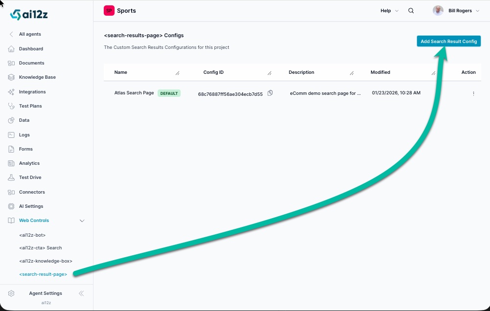
List of Configurations
The configuration list displays all your Search Result Page configurations. Each entry shows:
| Field | Description |
|---|---|
| Name | A descriptive identifier for the configuration |
| Config ID | Unique identifier used to reference this configuration in your code with the config-id attribute |
| Description | Brief explanation of the configuration's purpose |
| Modified | Last update date and time |
| Default | Badge indicating which configuration is the default |
| Action | Menu with options to edit, preview, or delete the configuration |
Using a Configuration
When you have multiple configurations, specify which one to use by adding the config-id attribute:
<!-- Using a specific configuration -->
<search-result-page data-key="<API_KEY>" config-id="68c76887ff56ea304ecb7d55">
</search-result-page>

<!-- Using the default configuration -->
<search-result-page data-key="<API_KEY>"></search-result-page>
Reading Search Queries from URL
The component automatically reads the search query from the URL parameter searchText:
/search?searchText=Can+you+wash+your+clothes
/search?searchText=ski+boot+sizing+guide
/search?searchText=best+helmets+for+beginners
Configuration Tabs
Each configuration consists of four main tabs: Display, Settings, Welcome, and View. These tabs allow you to control different aspects of the Search Result Page behavior and appearance.
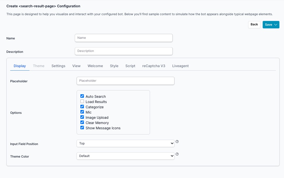
Display Tab
The Display tab controls the visual appearance and layout of your Search Result Page.
Basic Information
| Setting | Description | Example |
|---|---|---|
| Name | Configuration identifier (used only in admin list view) | "Default", "Atlas Search Page", "eComm demo search page" |
| Description | Brief explanation of configuration purpose (admin only) | "Main search for homepage", "eComm demo search page for Atlas Store" |
Display Options
| Setting | Description | Default/Example |
|---|---|---|
| Placeholder | Placeholder text shown in the search input field | "Search for Atlas products or information" |
| Input Field Position | Where to place the search input | "Top" (recommended for search pages) |
Options
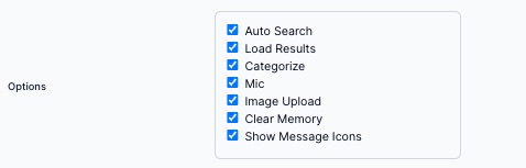
The Options section provides checkboxes to control various features:
| Option | Description |
|---|---|
| Auto Search | When enabled, automatically executes search on page load if searchText URL parameter exists |
| Load Results | When enabled, automatically loads search results on page load |
| Categorize | When enabled, shows search results grouped by category |
| Mic | When enabled, provides voice input capability for hands-free search |
| Image Upload | When enabled, allows users to upload images for visual search queries |
| Clear Memory | When enabled, provides option to clear conversation history |
| Show Message Icons | When enabled, displays icons alongside messages |
Theme Color
The Theme Color dropdown allows you to choose a visual theme for your Search Result Page. The theme controls colors, styling, and overall appearance.
Available Options:
- Preset Themes: Pre-configured color schemes including Default, Cyan, Amber, Orange, Purple, Red, Pink, Brown, Slate, Sky, Lime, Yellow, and Indigo
- Custom: Create a personalized theme using your brand colors and CSS variables
Custom Theme Creation
When you select "Custom" from the theme dropdown, ai12z will automatically begin the theme creation process.
Important: Before creating a custom theme, we strongly recommend completing the AI Brand Creation process first. This will analyze your brand assets and automatically generate appropriate colors, fonts, and styling guidelines that will be used in your custom theme.
To create a custom theme:
-
Complete Brand Guidelines First (Recommended)
- Navigate to AI Settings → Brand Guidelines
- Follow the AI Brand Creation guide to upload your brand images
- Generate and save your brand guidelines
-
Select Custom Theme
- Return to your search-result configuration
- Choose "Custom" from the Theme dropdown
- The system will automatically create a theme based on your saved brand guidelines
-
Theme Auto-Generation
- If you have completed brand guidelines, the custom theme will automatically inherit:
- Primary and secondary brand colors
- Accent colors for highlights and interactions
- Typography preferences
- Overall visual style consistency
- If no brand guidelines exist, a default custom theme template will be created that you can manually customize
- If you have completed brand guidelines, the custom theme will automatically inherit:
Benefits of Custom Theme with Brand Guidelines:
- Brand Consistency: Automatically matches your website's visual identity
- Professional Appearance: Cohesive design that reflects your brand personality
- Time Saving: No manual color picking or style configuration needed
- Responsive Design: Optimized for all device sizes while maintaining brand integrity
Settings Tab
The Settings tab controls behavior, limits, voice settings, and search parameters.
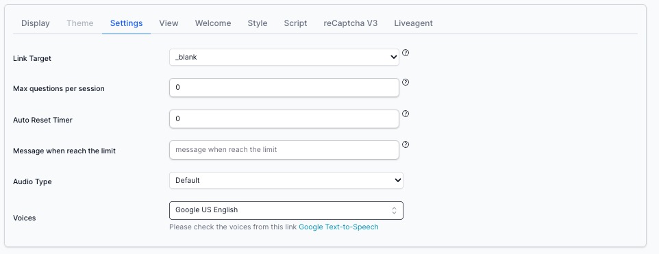
Configuration Settings
| Setting | Description | Default/Example |
|---|---|---|
| No Results Text | Message shown when no search results are found | "No results found" |
| Placeholder | Placeholder text in the search input field | "AI search" |
| Link Target | How search result links open | _blank (new tab) |
| Max questions per session | Maximum number of questions allowed per session (prevents abuse) | 5 |
| Auto Reset Timer | Minutes of inactivity before resetting the session | 0 (disabled) |
| Message when reach the limit | Text shown when question limit is reached | "Sorry, you have reached your message limit" |
| Audio Type | Audio feedback style | "Default" |
| Voices | Text-to-speech voice selection | "Google US English" |
| Max Results | Maximum number of search results to display | 4 |
| Score | Minimum relevance score threshold (0-1 slider) | 0.6 |
Preventing Chatbot Abuse and Token Drain
Overview
If a public-facing search-result Search is targeted by automated spam (bots/scripts), it can generate excessive AI requests and consume tokens. ai12z provides controls to mitigate this:
- Max Questions per Session - Hard usage cap per session
- Auto Reset Timer - Automatically reset sessions after inactivity
- reCAPTCHA v3 - Bot detection (can be configured separately)
Max Questions per Session
What it does:
Max Questions per Session sets a hard ceiling on how many questions a single chat session can send to the AI. Once the limit is reached, the bot stops issuing additional AI requests, preventing further token spend from that session.
Why it prevents token drain
Even if a bot attempts to spam the chat UI, it cannot generate unlimited AI calls within the same session—usage is capped.
Note: See Directives [directive=badActor] for one of the best ways to eliminate a bad actor.
Where to configure
In your <search-result-page> configuration:
- Go to Settings
- Set Max questions per session
- (Optional) Set Message when reach the limit (recommended for clear UX)
- (Optional) Configure Auto Reset Timer to reset the session after a defined period of inactivity (or leave at
0if you want the cap to effectively require a new session)
Recommended settings (baseline)
- Max questions per session:
10–25(start at 20 for most sites) - Message when reach the limit: “You’ve reached the question limit for this session. Please try again later.”
- Auto Reset Timer:
30–60 minutes(or0if you prefer stricter behavior)
Welcome Tab
The Welcome tab allows you to create custom welcome screens with Quick Answer buttons, FAQs, or categorized shortcuts. This appears when users first land on the search page or when no search is active.
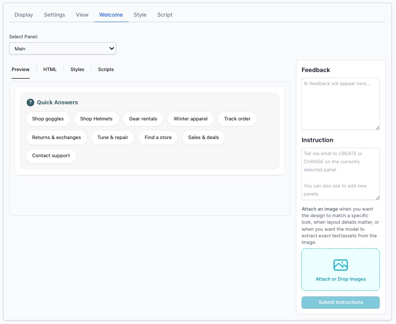
Features
- Custom HTML: Insert any HTML content in the welcome screen
- Quick Answer Buttons: Create pre-configured question buttons that users can click
- Multi-panel Support: Build complex layouts with multiple information panels
- Interactive Elements: Use
sendMessage()andsendJSON()for dynamic interactions - Dedicated Styling: Welcome panel has its own Styles and Scripts tabs for customization
Select Panel
Choose which panel to edit from the dropdown (e.g., "Main" panel).
Preview Tabs
- Preview: See how your welcome screen looks
- HTML: Edit the HTML content
- Styles: Add custom CSS for the welcome panel
- Scripts: Add custom JavaScript for welcome panel interactions
Feedback Panel
Displays real-time feedback as you make changes to help you understand the results of your customizations.
Instruction Panel
Use AI to generate or modify your welcome panels:
- Describe what you want to create or change
- Optionally attach an image for design reference
- Click Submit Instructions
- The AI will generate the panel layout based on your description
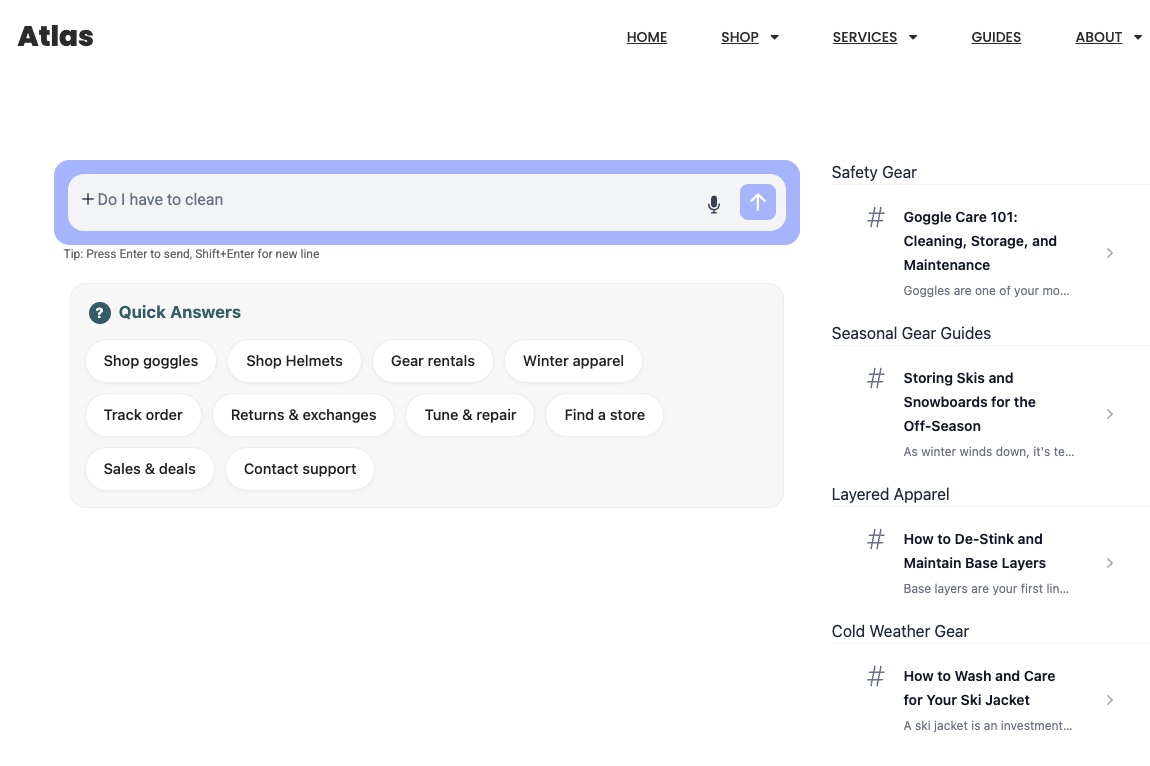
Example: Atlas Store Welcome Screen
The screenshot shows an outdoor gear e-commerce welcome screen with:
- Heading: "Quick Answers"
- Quick Action Buttons: Organized in three rows:
- Row 1: Shop goggles, Shop Helmets, Gear rentals, Winter apparel
- Row 2: Track order, Returns & exchanges, Tune & repair, Find a store
- Row 3: Sales & deals, Contact support
- Categories: Safety Gear, Seasonal Gear Guides, Layered Apparel, Cold Weather Gear
- Action: Each button triggers either a pre-populated search or navigates to a specific section
This provides shoppers with immediate access to popular categories and common tasks, improving the search page experience even before they enter a query.
View Tab
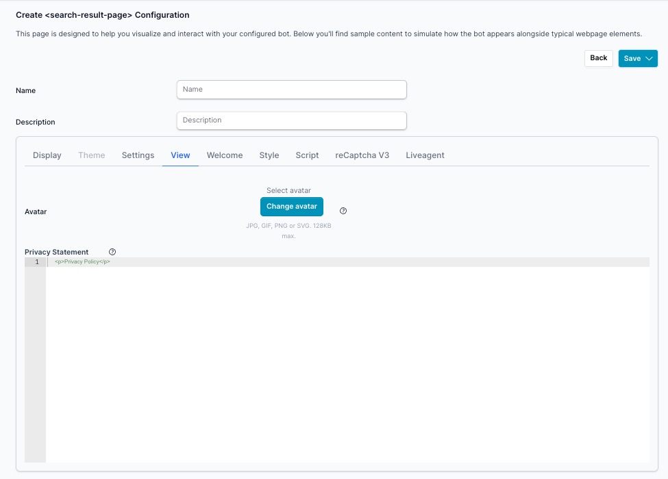
The View tab manages the visual identity assets and privacy notice displayed within the Search Result Page.
Avatar
The avatar is the icon or image that represents the AI assistant alongside responses on the search result page. It gives the assistant a recognizable visual identity consistent with your brand.
- Button: Click Change avatar to upload or replace the current avatar
- Accepted formats: JPG, GIF, PNG, or SVG
- Max file size: 128KB
Privacy Statement
The Privacy Statement is an HTML field that displays a brief privacy notice to users within the search result interface. Use this to communicate your data practices or link to your full privacy policy.
Default value:
<p>Privacy Policy</p>
Example with link:
<p>
  Your privacy is important to us.
  <a href="/privacy-policy" target="_blank">View our Privacy Policy</a>
</p>
Best Practices:
- Keep the message short and clear
- Link to your complete privacy policy page using an anchor tag
- Use reassuring language about data protection
reCAPTCHA V3 Tab
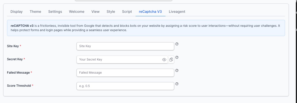
reCAPTCHA v3 is a frictionless, invisible tool from Google that detects and blocks bots on your website by assigning a risk score to user interactions — without requiring user challenges like checkboxes or image puzzles. It helps protect your Search from automated abuse while providing a seamless experience for real users.
When enabled, every interaction with the Search is scored by Google. Interactions falling below your configured threshold are blocked before any AI request is made, protecting against token drain and spam.
Fields
| Field | Required | Description |
|---|---|---|
| Site Key | Yes | The public key from your Google reCAPTCHA v3 registration. Used in the front-end to load the reCAPTCHA script |
| Secret Key | Yes | The private key from your Google reCAPTCHA v3 registration. Used server-side to verify the token score |
| Failed Message | Yes | The message displayed to the user when their interaction is blocked due to a low reCAPTCHA score |
| Score Threshold | Yes | A value between 0.0 and 1.0. Interactions scoring below this threshold are blocked. Google recommends starting at 0.5 |
Getting Your reCAPTCHA v3 Keys
- Go to Google reCAPTCHA Admin Console
- Click + to create a new site
- Select reCAPTCHA v3 as the type
- Add your domain(s)
- Copy the Site Key and Secret Key into the fields above
Score Threshold Guide
| Score | Meaning |
|---|---|
1.0 | Very likely a human |
0.5 | Recommended starting threshold |
0.3 | More permissive — allows more borderline traffic |
0.0 | No filtering (effectively disabled) |
Start at 0.5 and adjust based on your traffic patterns. If legitimate users are being blocked, lower the threshold slightly. If you're still seeing abuse, raise it.
Failed Message Example
Our system detected unusual activity. Please try again or contact support if this continues.
Keep the message user-friendly — legitimate users can occasionally receive a low score on restricted networks or with VPNs.
Best Practice: Combine with Max Questions per Session
reCAPTCHA v3 blocks automated traffic before AI requests are made. Pairing it with Max Questions per Session (in the Settings tab) provides two layers of protection:
- reCAPTCHA v3 — blocks bots at the entry point
- Max Questions per Session — caps usage for any session that gets through
Together they significantly reduce the risk of token drain from automated abuse.
Liveagent Tab
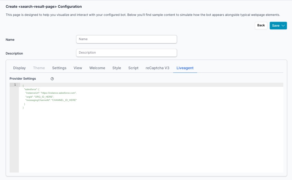
The Liveagent tab allows you to connect your search-result Search to a live agent platform, enabling seamless handoff from the AI assistant to a human agent when needed. When configured, the search-result can escalate conversations to a live support channel based on user intent or explicit request.
Provider Settings
The Provider Settings field accepts a JSON configuration object that defines your live agent provider and connection details. The structure varies by provider.
Salesforce Example
{
  "salesforce": {
    "instanceUrl": "https://instance.salesforce.com",
    "orgId": "ORG_ID_HERE",
    "messagingChannelId": "CHANNEL_ID_HERE"
  }
}
| Field | Description |
|---|---|
instanceUrl | The URL of your Salesforce instance (e.g., https://yourorg.my.salesforce.com) |
orgId | Your Salesforce Organization ID, found in Setup → Company Information |
messagingChannelId | The Messaging Channel ID for the Salesforce Messaging for In-App and Web channel configured for live agent handoff |
Getting Your Salesforce Values
- Instance URL — Log in to Salesforce and copy the base URL from your browser (e.g.,
https://yourorg.my.salesforce.com) - Org ID — Go to Setup → Company Information and copy the Salesforce Organization ID
- Messaging Channel ID — Go to Setup → Messaging Settings, open your Messaging for In-App and Web channel, and copy the Channel ID from the URL or channel detail page
How It Works
Once configured, the search-result Search can route users to a live agent when:
- The user explicitly requests a human agent
- The AI detects a conversation topic that should be handled by a human
- A configured directive or rule triggers an escalation
The live agent chat session opens within the same search-result dialog, providing a continuous experience without redirecting the user to a separate support page.
Configuration Management
- Use Descriptive Names: Name configurations based on their use case (e.g., "Main Site Search", "Product Search", "Help Center Search")
- Set a Default: Always designate one configuration as default for fallback behavior
- Test Responsive Design: Verify search page appearance on desktop, tablet, and mobile devices
- Test URL Parameters: Ensure
searchTextparameter is properly read and executed
Welcome Screen Design
- Limit Quick Answers: Use 6-12 buttons maximum to avoid overwhelming users
- Organize by Category: Group related buttons together (e.g., "Shop", "Support", "Account")
- Use Clear Labels: Make button text concise and action-oriented
- Consider User Intent: Tailor quick answers to common searches for your site
URL Integration
- Use Standard Parameter: Stick with
searchTextas the URL parameter name for consistency - Encode Queries: Always use
encodeURIComponent()when constructing URLs with queries - Handle Empty Queries: Show the welcome screen when no
searchTextparameter is present - Test Deep Links: Verify shared search URLs work correctly
Performance Optimization
- Set Reasonable Limits: Protect against abuse with session limits if needed
- Enable Auto Search: Turn on "Auto Search" and "Load Results" for immediate results on page load
- Optimize Welcome HTML: Keep welcome screen HTML lightweight
- Test Load Times: Ensure search page loads quickly with various query types
Voice and Audio
- Choose Appropriate Voice: Select a voice that matches your brand personality
- Test Audio Type: Verify audio feedback works across different browsers
- Consider Accessibility: Voice features help users with visual impairments
Related Documentation
- Search Results Integrations - Search results page component integration
- Search Panel - Search panel component documentation
- search-result Search Component - Modal dialog search alternative
- Agent Settings - Managing your agent and API keys
- AI Brand Creation - Customizing theme with brand guidelines